Imagine you land on a website, and the background picture instantly captivates your attention. You feel an immediate connection, a curiosity to explore more.
That’s the power of a good landing page background picture. But what makes it so effective? How can you ensure your website has the perfect visual appeal? This article is your guide to mastering the art of choosing the right background image that not only grabs attention but also resonates with your audience.
We’ll uncover the secrets behind selecting images that speak directly to your visitors’ emotions and desires, making them more likely to engage and convert. Ready to transform your landing page into a magnetic force? Let’s dive in!

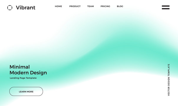
Credit: www.vecteezy.com
Importance Of Background Image
The first thing visitors see is the background picture. It sets the mood for the entire page. A good image can grab attention quickly. Visitors decide to stay or leave in seconds. Bright, clear images work best. They should connect with your content. A cluttered image can confuse people. Simple images help in focusing on the message. Make sure the picture is of high quality. Blurry images may drive people away.
A good background image enhances the user’s journey. It makes the page more interesting. Images should match the theme of your site. They create a consistent look. This makes users feel comfortable. Relevant images can explain ideas without words. This helps users understand content faster. Colorful images can make the page lively. But they should not be too bright. Overly bright images can hurt the eyes.
Elements Of A Good Background Picture
A good background picture must be high resolution. This means the picture is clear and sharp. It should not be blurry. People like pictures that look nice. A high-quality picture makes the page look professional. It helps build trust. People stay longer on the page. They like what they see.
The picture should match the content. It needs to relate to what you offer. For example, if you sell shoes, show shoes. This helps people understand your message. It also makes them feel connected. A relevant picture can tell a story. It can explain your brand in a simple way.
It’s important that the picture fits your brand. Use colors that match your logo. The style should be the same as your other pictures. This helps people know your brand. Consistency builds recognition. People remember your brand easily. They will come back to your site again.
Choosing Colors And Themes
Colors affect how people feel. Blue often makes people calm. Red can make them feel excited. Yellow can bring happiness and cheer. Green is linked to nature and peace. Picking the right color is very important. It sets the mood for your page. Colors can guide how users act. Choose colors that match your brand.
Design elements must match your chosen colors. The layout should be simple. Keep the text easy to read. Use high-quality images. Photos should tell a story. They should fit well with the colors. Images and colors together make a strong impact. They can engage the audience. Make sure all elements work well together.
Optimizing For Different Devices
Selecting the right background picture for a landing page enhances user experience on all devices. A simple, high-quality image loads quickly and maintains visual appeal. Consistency across different screens ensures that visitors enjoy a seamless browsing experience.
Responsive Design
A good landing page should look great on all devices. This means the background picture must be flexible. It should adjust easily to different screen sizes. A responsive design ensures this happens. The image should not be too large. Large images slow down the page. Use a clear and lightweight image. This helps with faster loading. It also improves user experience.
Mobile-friendly Considerations
Many people use phones to browse. The background picture should be mobile-friendly. It should not cover important text. Keep the image simple. Avoid distracting elements. The focus should be on content, not just the picture. Make sure buttons are easy to click. Text should be readable without zooming. A good mobile design keeps users happy. They will stay longer on the page.
Avoiding Common Mistakes
Overcrowded images make a page look messy. They confuse the viewers. A busy background takes away focus. Simple images work best. They guide the viewer’s eye. Choose images with clear subjects. This helps in understanding the message.
Distracting elements ruin the viewer’s focus. Bright colors or patterns can be too much. They take attention away from important content. Calm backgrounds keep the focus clear. Use neutral colors. These help in keeping the focus on the text.

Credit: stock.adobe.com
Testing And Feedback
A/B Testing Techniques help you understand what works best. Create two different pages. Show each page to different groups. Compare which one performs better. This is called A/B testing. It’s like a contest. The page with more clicks wins. Testing helps find the perfect picture. A good picture makes people stay. Staying means more chances to buy. Always test different pictures.
Gathering User Insights is important. Ask users what they like. Listen to their thoughts. Their feedback is gold. It helps improve the page. Use surveys or direct questions. Make it simple for users to answer. Happy users mean a better page. A better page means more success. Always keep asking for feedback.
Credit: stock.adobe.com
Frequently Asked Questions
What Is The Best Background Color For A Landing Page?
Choose a light background color for your landing page. White, light gray, or soft pastel shades work best. They enhance readability and create a clean, professional look. Ensure contrast with text and images for clarity. A neutral palette helps focus users’ attention on key content and calls to action.
What Does A Good Landing Page Look Like?
A good landing page is visually appealing and loads quickly. It has a clear headline, engaging content, and a strong call to action. It should be mobile-friendly and use SEO best practices to enhance visibility. Testimonials and social proof can boost credibility and conversions.
What Size Should A Website Landing Page Background Be?
A website landing page background typically measures 1920×1080 pixels. This size ensures optimal display across devices. Use high-quality images to maintain clarity. Adjust dimensions based on design needs, ensuring responsiveness. Test on various screens to verify appearance. Keep file size manageable for quick loading.
How Do I Choose A Background Image For My Website?
Choose a background image that aligns with your brand. Ensure it’s high-quality and doesn’t distract from content. Opt for images that convey your message and enhance user experience. Consider the site’s loading speed and responsiveness. Test visibility and readability on various devices and screen sizes.
Conclusion
A great landing page background boosts user engagement. It should be clear and relevant. Avoid cluttered or distracting images. Simple colors work best. Ensure the picture aligns with your brand message. High-quality visuals make a strong impression. They can guide the visitor’s focus.
A well-chosen image enhances readability and usability. Test different options to find the best fit. Prioritize user experience over flashy designs. Your goal is a smooth, effective journey for the visitor. With the right background, your landing page stands out.
It leaves a lasting impact on visitors.