Imagine you’ve just clicked on a link with the promise of discovering something exciting. What you land on next is crucial.
Yes, it’s the landing page—your first impression, your digital handshake. But what exactly makes a landing page effective? How can you ensure it captures attention and compels action? By understanding the essential parts of a landing page, you can transform your website into a conversion powerhouse.
This is not just about aesthetics; it’s about strategically crafting each component to guide your visitors towards a desired action. Ready to unlock the secrets of a compelling landing page? Dive in and discover how to captivate your audience from the very first click.
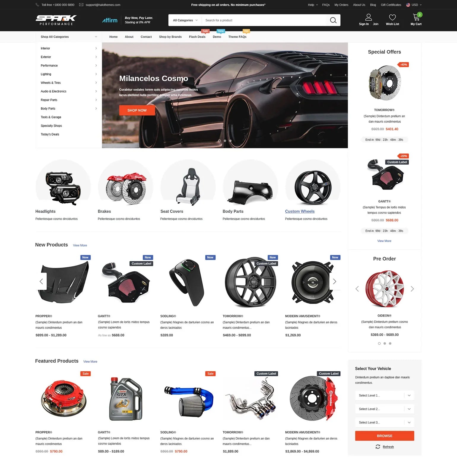
Hero Section
The headline is the first thing visitors see. It should be clear and catchy. Good headlines grab attention quickly. They tell visitors what the page is about. Simple words make it easy to understand.
The subheadline provides more details. It supports the main headline. Subheadlines should be short and informative. They add context to the headline. This helps visitors know what to expect. Use simple language for clarity.
The call-to-action (CTA) encourages action. It tells visitors what to do next. Examples are “Sign Up” or “Learn More.” CTAs should stand out. Bold colors make them noticeable. Short CTAs work best. They guide visitors to take a step forward.
Visual Elements
Images make a landing page look nice. They catch the eye. Good images tell a story. They show what the website is about. Choose images that are clear. Make sure they fit the message. Avoid blurry images. They can confuse visitors.
Videos are powerful tools. They engage visitors quickly. A short video can explain a lot. It can show how things work. Keep videos simple. Avoid long videos. They might bore visitors. Ensure videos load fast. Slow videos can frustrate users.
Graphics add style. They can be charts or icons. Graphics make information easy to grasp. Use them to highlight key points. They help in breaking text. Good graphics make content clearer. Choose bright colors. They attract attention.
Value Proposition
Benefits tell users why your offer is good. They show what users gain. Benefits can be saving time or money. They can also be feeling happy or relaxed. Use benefits to show value. Make them clear and easy to see.
Features show what your product or service does. They are the parts or qualities of your offer. Features can be fast speed or easy use. They can also be special tools or options. Make sure features are clear. Help users understand them easily.
Differentiators are what make you special. They show why you are better than others. Differentiators can be unique styles or rare options. They can also be high quality or trusted service. Highlight them to stand out. Show why users should choose you.
Social Proof
Testimonials show what happy customers think. They share their positive experiences. These words can build trust. They are like stories from real people. Short and sweet words work best. Visitors read them quickly. They feel more comfortable. They might try the service too.
Case studies tell detailed stories. They explain how problems were solved. They show real results. Numbers and facts are included. They prove success. People love seeing how things worked. It makes them believe in the product. It is like a mini storybook. This makes the landing page strong.
Reviews are everywhere online. They are like friendly advice. People trust them. They give scores or stars. Good reviews make users happy. They see others like the service. It helps them decide. Honest reviews are best. They show both good and bad. This makes things real and honest.
Lead Capture Form
Fields collect user information. They ask for names, emails, and phone numbers. Simple fields make forms easy. Clear labels help users. Less fields save time. Users fill them quickly. More fields can confuse. It’s important to keep them short.
The submit button sends data. Bold and bright colors grab attention. Clear text shows its purpose. Users press it after filling out forms. Easy-to-find buttons increase submissions. Simple designs are best. Clickable buttons ensure action.
Privacy assurance builds trust. It tells users their data is safe. Short statements work well. Clear promises make users feel secure. Visible notices help users. Privacy policies should be easy to find. Trust symbols like locks are useful.
Credit: halothemes.net
Trust Signals
Certifications show quality and skill. They build trust with visitors. Displaying certifications on a landing page is important. It tells users that the business is credible. It assures them of the service’s or product’s reliability. This trust encourages visitors to make a purchase.
Awards highlight success and achievement. They prove excellence in a field. Showing awards can impress visitors. It gives them confidence in the brand. Awards are a strong trust signal. They help users feel secure in choosing the service or product.
Security badges protect personal information. They show the site is safe. Visitors look for security badges when sharing details. These badges assure them their data is safe. They help build trust and encourage transactions. Security badges are key for online safety.
Navigation
Links help users move around a website. They are like roads for your fingers. Important links go to key pages. Easy links help users find what they need quickly. Every link should be clear and simple.
Menus list options for users to choose. A menu is like a map of the website. It shows where you can go. Menus should be simple. They should have clear labels. Drop-down menus let users see more choices. They are helpful and save space.
Breadcrumbs show the path a user has taken. They help users know where they are on a site. Breadcrumbs are like a trail of crumbs. They guide users back to where they started. Clear breadcrumbs make navigation easy. They improve the user experience.

Credit: www.globalreach.com
Footer
The footer is an essential part of a website landing page. It contains contact details, social media links, and important site information. Often overlooked, it enhances user navigation and site credibility.
Contact Information
Contact details help visitors reach you. Include phone number and email. Make sure they are easy to find. Clear contact information builds trust.
Social Media Links
Social media buttons connect your page with your profiles. They let visitors follow your updates. Place them visibly in the footer. This encourages more interaction.
Additional Resources
Links to extra content provide value. They might include guides or articles. Additional resources can help users. Keep them organized and relevant.

Credit: www.wix.com
Frequently Asked Questions
What Are The Parts Of A Landing Page?
A landing page typically includes a compelling headline, engaging visuals, concise benefits, a call-to-action button, and user testimonials. It’s designed to convert visitors into leads or customers by focusing on a specific offer or product. Optimizing these elements improves user experience and enhances conversion rates.
What Should A Landing Page Consist Of?
A landing page should include a clear headline, engaging visuals, concise copy, strong call-to-action, and user-friendly design. Ensure fast loading time and mobile responsiveness. Highlight benefits and testimonials to build trust. Use relevant keywords to optimize for search engines and improve conversions.
How Should A Landing Page Be Structured?
A landing page should have a clear headline, engaging visuals, concise content, a compelling call-to-action, and an easy-to-navigate layout. Ensure fast loading times and mobile responsiveness. Optimize for SEO with relevant keywords and meta descriptions to enhance visibility. Keep the design clean to focus user attention.
What Is The Format Of A Landing Page?
A landing page format includes a compelling headline, engaging visuals, and persuasive content. It has a clear call-to-action, simple navigation, and a form for lead capture. Social proof and testimonials enhance credibility. The design should be mobile-friendly and optimized for quick loading to improve user experience and conversion rates.
Conclusion
A landing page needs essential parts to succeed. Clear headlines grab attention fast. Visuals create a strong first impression. Concise, persuasive text keeps visitors engaged. Call-to-action prompts drive actions. Trust elements build credibility. Simplified navigation ensures easy exploration. Mobile-friendly design reaches more users.
Each element must be carefully crafted. Together, they create a seamless user experience. Effective landing pages convert visitors into leads. Consistent updates and testing boost performance. Understanding these parts enhances your website. Now, optimize your landing page. Watch your engagement grow.
Achieve better results with simple, effective strategies. The key is in the details.
