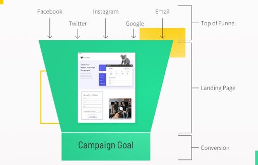
Imagine you’re about to launch your next big online campaign. You’ve poured your heart into creating compelling content and a perfect product.
But there’s one crucial piece of the puzzle that can make or break your success: the landing page. You might be wondering, “What does a typical landing page have that transforms curious visitors into dedicated customers? ” This is your golden ticket to understanding the essential elements that can captivate your audience and drive conversions.
In this blog post, we’re going to take a close look at the anatomy of a landing page. You’ll discover the must-have components that attract attention, build trust, and compel action. We’ll delve into the psychology behind each element, ensuring you know exactly how to craft a page that resonates with your audience. Whether you’re a seasoned marketer or new to the digital landscape, this guide will provide you with the insights needed to create landing pages that not only meet industry standards but exceed your expectations. Prepare to unlock the secrets that turn clicks into meaningful engagements.
Purpose Of A Landing Page
A landing page has one main job. It guides visitors to take action. This action could be signing up for a newsletter. Or buying a product. The page is simple. It has no distractions. Clear design makes it easy to focus on the action. Strong headlines grab attention quickly. Visitors should know the purpose in seconds.
Visuals like images help explain the message. They make the page more engaging. Call-to-action buttons are important. They tell visitors what to do next. The text should be clear and persuasive. Trust elements like reviews or badges build confidence. They show others trust the product or service.
Credit: www.leaddigital.com
Compelling Headline
A landing page needs a clear headline. Visitors should know the offer quickly. Words must grab attention. Simple and direct language works best. The headline should match the ad or link. Consistency builds trust. A strong headline keeps users engaged. It should be easy to read. Use large font size for visibility. Bright colors can help too. Make it stand out from other text. A headline is the first impression. It matters a lot. Be sure it speaks to the audience. Ask a question or make a bold statement.
Engaging Visuals
Images and videos make a landing page eye-catching. They grab attention quickly. A strong image tells a story. Videos explain ideas better. They keep visitors on the page longer.
Choose clear and bright images. Use short and simple videos. Make sure they load fast. This keeps the page user-friendly.
Colors set the mood. They can make visitors feel calm or excited. Use colors that match your brand. This helps people remember you.
Too many colors can confuse visitors. Stick to two or three main colors. Make sure text is easy to read. Use contrasting colors for text and background. This keeps the page clean and easy to navigate.
Concise Copy
Value Proposition is the first thing people notice. It shows what makes your offer special. A clear value statement tells why your product is the best choice. People should understand it quickly.
Next is the Benefits Overview. This part explains what people get. It is about the good things your product or service provides. Use simple words to tell how it helps. People should feel they need it.
A good landing page answers questions fast. It should be easy to read. Short sentences work best. Use bold for important words. This helps people know what matters. Make sure the page is neat and tidy.
Call To Action
Buttons should be easy to see. They should stand out. Use bright colors. Blue and red work well. The size matters too. Big buttons are better. Small buttons are hard to click. Shapes can be fun. Round buttons look friendly. Square buttons look strong.
Text on the button is important. Use simple words. “Buy Now” or “Sign Up” work best. Words need to be big. They should be easy to read. Keep the text short. Long words confuse people. Action-oriented text makes people click. Be clear with what you want them to do.
Lead Capture Form
The lead capture form is very important. It collects valuable information. Name and email are essential fields. Sometimes, phone number is needed too. These fields help in reaching out. They build a connection. Forms should be easy to fill. Nobody likes long forms. Short forms get more responses. Clearly label each field. It makes forms more understandable.
Privacy is a big concern. Users fear sharing personal info. Assure them their data is safe. Use clear language. State how you protect their information. Explain why you collect data. Tell them about your privacy policy. Make them feel secure. Trust is important. Without trust, they won’t share. Keep your promises. Protect their data well.
Social Proof
Testimonials build trust quickly. Visitors like real stories. They want to know others’ experiences. Short quotes work best. Choose happy, satisfied customers. Their words should be clear and honest. Make sure they feel genuine. Add their name and photo if possible. This adds credibility.
User reviews are powerful. They show real-life use. Many users trust them more. Display star ratings too. High ratings attract attention. Keep reviews simple and easy to read. Show positive and negative ones. Balance is key. Highlight important points in bold. This helps users see them quickly.
Trust Signals
Security badges make users feel safe. They show the site is secure. Users trust sites with security badges more. These badges may include SSL certificates. They can also show payment security.
Badges are usually placed near forms. Or near checkout buttons. This placement reassures users. It makes them confident to share information.
Brand logos show credibility. They tell users which brands work with you. Logos of popular brands increase trust. Users believe in brands they know. This builds confidence in your service.
Displaying logos on landing pages is common. They are often placed at the bottom. Or at the top of the page. This visibility boosts trust from the start.
Mobile Responsiveness
A good landing page must look great on any device. Mobile users need a page that is easy to read. Text should be large enough to see. Buttons must be big enough to tap. Fast loading is key for keeping visitors happy. Slow pages make people leave. Images should adjust to screen size. If they don’t, users can’t see them well. Menus need to be simple and easy to use. Too many options confuse visitors. A clean layout helps users find what they need. Test the page on different phones. This ensures everyone has a good experience. Make sure links work on mobile devices. Broken links frustrate users. Good mobile design helps people stay longer. This can lead to more sales.

Credit: www.archetype.co
Loading Speed
Loading speed is crucial for a landing page. Slow pages can frustrate users. Fast pages keep users happy. Studies show people leave slow websites quickly. They do not wait. Fast loading makes more people stay. It helps in getting more leads. People like websites that load fast. It saves their time. Images should be small and clear. They should not be heavy. Heavy images slow down the page. Scripts must be optimized. They should run smoothly. Hosting affects speed too. Reliable hosting is important. It supports fast loading. Caching helps reduce loading time. It stores data for quick access. Lazy loading delays loading of images. It speeds up the page loading time. Every second counts in loading speed.
Analytics Integration
Analytics helps understand how a landing page performs. It shows how many visitors come to the page. It reveals which parts of the page they like most. Data tells us if the page needs changes. Tracking is crucial for success. It helps find what works best. Reports give insights into visitor behavior. They show which buttons get clicks. They tell us which offers attract attention. Metrics help improve the page. They guide decisions for changes. Conversion rates show if visitors take action. They measure if people buy or sign up. Tools like Google Analytics are used. They are simple to set up. They provide detailed information. Everyone can use them easily. Analytics is key for a successful landing page.

Credit: getshogun.com
Frequently Asked Questions
What Should A Landing Page Consist Of?
A landing page should include a compelling headline, clear call-to-action, concise content, engaging visuals, and trust indicators like testimonials or reviews.
What Is The Content Of A Landing Page?
A landing page includes a compelling headline, engaging visuals, persuasive copy, clear call-to-action, and user-friendly design. It often contains testimonials, benefits, and features of the product or service. Ensure the page is optimized for SEO with relevant keywords to enhance visibility and attract more visitors.
What Are The Requirements For A Landing Page?
A landing page requires a clear headline, engaging visuals, concise content, a strong call-to-action, and responsive design. Ensure fast loading speed and include social proof for credibility. Optimize for SEO with targeted keywords and meta tags. Keep the form simple to encourage conversions.
What Is A Standard Alone Landing Page?
A standalone landing page is a single web page focused on converting visitors. It promotes a specific product or service, captures leads, and drives action. Its design emphasizes clarity and simplicity, often featuring a call-to-action, concise content, and engaging visuals to enhance user experience and conversion rates.
Conclusion
A typical landing page guides visitors smoothly. It includes clear headlines. Short and catchy. Eye-catching images draw attention. They enhance understanding. Call-to-action buttons encourage clicks. Simple and effective. Testimonials build trust quickly. You gain credibility. Forms collect useful information. They should be easy to fill out.
Minimal distractions keep focus. The goal is conversion. Every element matters. Test and optimize regularly. Success is within reach. Make changes based on feedback. A well-designed landing page boosts your chances. Keep it simple and direct. Always aim for clarity.
Your visitors appreciate it.


