Have you ever clicked on a link, landed on a page, and felt overwhelmed or lost? That’s because the landing page wasn’t structured correctly.
When done right, a landing page is your ticket to capturing attention and driving action. It’s not just about pretty images or catchy phrases; it’s about creating a seamless path that guides your visitors exactly where you want them to go.
Imagine crafting a page that not only holds your audience’s interest but compels them to take the next step—be it signing up, purchasing, or simply learning more. You’ll discover how to structure a landing page that converts visitors into loyal customers. Ready to turn clicks into meaningful interactions? Let’s dive in!
Crafting A Compelling Headline
A strong headline grabs attention fast. It should be clear and direct. Use simple words that everyone understands. Make sure the message is easy to read. Short sentences work best. The headline must match what visitors expect. This builds trust.
Try to solve a problem in your headline. Use active language that makes people think. The headline should be the biggest text on the page. This tells visitors where to look first. Make it stand out with a different color or style. Keep testing different headlines. Find which one works best.

Credit: www.smashingmagazine.com
Effective Use Of Subheadings
Subheadings make the page easy to read. They break up text into parts. Each part has a clear idea. Readers understand the content better with subheadings. They help guide the reader through the information. Important points stand out more.
Subheadings help with SEO too. They let search engines know the main topics. This can make the page rank higher. Use clear and simple words in subheadings. Keep them short. This makes them more effective.
Use subheadings to organize the page. They divide different sections. Readers find what they need quickly. Subheadings improve the user experience. Visitors stay on the page longer. This is good for engagement.
Designing A Captivating Hero Section
The hero section is the first thing people see. It needs to be eye-catching and clear. Use a big, bold headline. This will grab attention. Add a short subheading. Explain what you offer. Use bright colors and nice images. Images should relate to your product. Make it easy for people to understand your message.
A call-to-action is very important. Use simple words like “Buy Now” or “Learn More”. Keep it visible and easy to find. Avoid clutter. Too many words can confuse. The hero section should be clean and focused. This helps visitors know where to look.

Credit: www.wix.com
Incorporating Clear Call-to-actions
Clear call-to-actions make it easy for visitors. They know what to do next. Simple words work best. “Sign Up” or “Learn More” are good examples. Keep it short and direct. Visitors should never feel confused. They need a clear path to follow. A confused mind says no.
Place call-to-actions where they stand out. Top of the page is great. Also, after important information. Repeat them if needed. But do not overdo it. More is not always better. Balance is key. Make sure they are easy to find.
Colors can help call-to-actions pop. Use colors that stand out. But ensure they match your page theme. Bright colors can catch the eye. But do not use too many. Keep it simple and clean. This helps in grabbing attention.
Building Trust With Social Proof
Clients love to share their stories. Testimonials show real experiences. They tell how products helped them. Use honest words from happy clients. Make sure they are easy to read. Short sentences work best. Real stories build trust quickly. Trust makes people feel safe. Safe customers are happy customers.
Client logos show who trusts you. They are symbols of trust and quality. Display them where people can see. Logos tell visitors you work with big names. Big names matter. They show you are reliable. People trust brands they know. Familiar brands mean good service. Good service brings more clients.
Case studies show detailed success stories. They explain how you solved problems. Solutions bring confidence. Readers like to see success. Success stories are proof. Proof leads to trust. Trust grows with detailed examples. Use simple words in case studies. Make them clear and easy to follow.
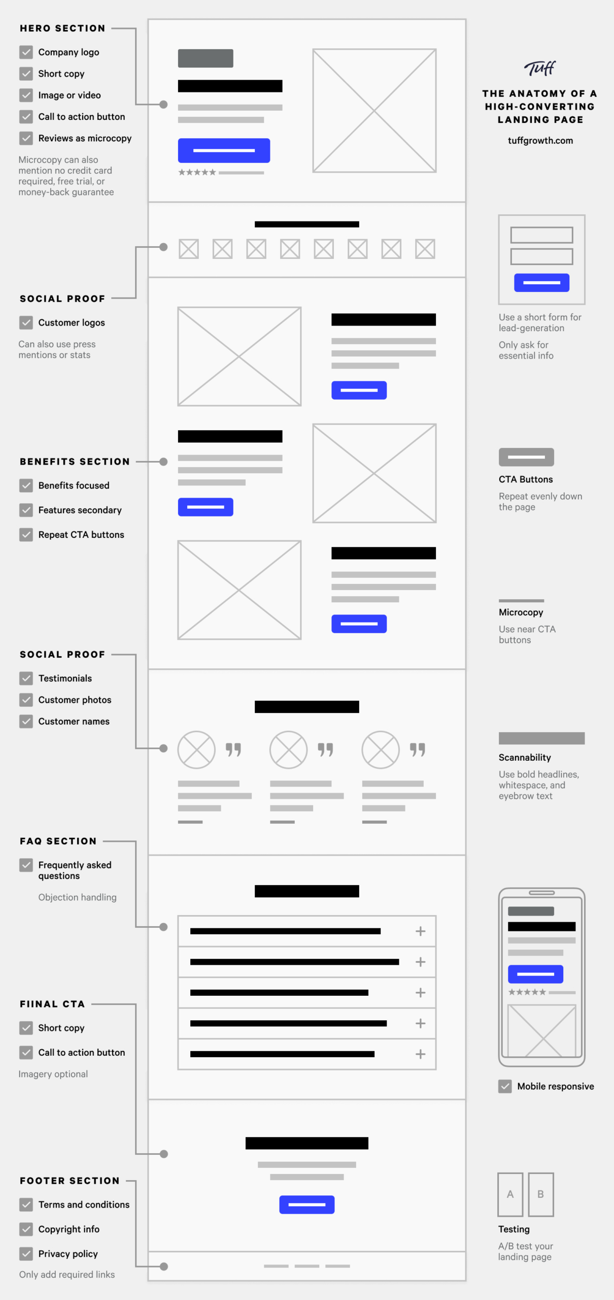
Credit: tuffgrowth.com
Using Visual Elements Strategically
Visual elements enhance engagement and guide visitors smoothly through a landing page. Images and videos create interest and highlight key points. Effective use of color and layout ensures a clear message and improves user experience.
Choosing Relevant Images
Images should match the topic. They must be clear and bright. Choose images that tell a story. This helps visitors understand the message. Bright colors can grab attention. Black and white images can look elegant. Use images that fit the brand. This keeps the page looking professional.
Utilizing Video Content
Videos can explain ideas quickly. They hold attention longer than text. Short videos work best. Keep them under two minutes. Use captions for those who cannot hear. Make sure videos load fast. Slow loading can cause visitors to leave. Always check if videos work on mobile devices.
Optimizing For Mobile Devices
Mobile devices are everywhere. They are used by many people. Landing pages must work well on these devices. Responsive design is important. It changes the page to fit the screen size. Buttons should be easy to press. Images need to be small. This helps the page load faster. Text should be clear. It must be big enough to read. Navigation should be simple. Users should find things easily. Links must be easy to click. Testing is important too. Check the page on different phones. This ensures everything works right.
Enhancing Page Load Speed
Fast loading pages make users happy. Use compressed images. It reduces load time. Small image size is better. Remove extra files. Clean code speeds up pages. Avoid large videos. They slow down pages. Use browser caching. It saves data and speeds up repeat visits.
Minimize redirects. They add delay. Use Content Delivery Networks (CDNs). CDNs improve loading speed. Place important content first. Users see it quickly. Optimize JavaScript and CSS. Reduced size means faster load. Choose fast hosting services. Servers matter for speed.
Implementing Seo Best Practices
Keywords are words people search. They help websites rank higher. Choose relevant keywords for your page. Place them naturally in your text. Bold important keywords so they stand out. Use keywords in headings and subheadings. This helps search engines understand your page. Avoid keyword stuffing. It can harm your ranking.
Meta tags provide search engines with page info. Title tags are very important. They should include main keywords. Keep them short and clear. Meta descriptions summarize page content. They should be catchy and include keywords. Both tags impact your visibility online. Good tags bring more visitors to your page.
Testing And Analyzing Performance
Try different versions of your landing page. You can change images, text, or buttons. Find out what works best. Compare the results with each version. Look for the one with more clicks or sign-ups. Make changes based on what you learn. Repeat this often. It helps improve your page over time.
Use tools like Google Analytics to track visitors. Check where they come from. See how long they stay on your page. Look at what they click on most. This tells you what is popular. Adjust your page to match user interests. It can make your page better. Watch the data closely. Data helps guide your decisions.
Frequently Asked Questions
How Should A Landing Page Be Structured?
A landing page should have a clear headline, concise copy, engaging visuals, a compelling call-to-action, and social proof. Ensure it loads quickly, is mobile-friendly, and aligns with the user’s intent. Optimize for SEO with relevant keywords and ensure a clean, intuitive design for better conversion.
What Is The Best Layout For A Landing Page?
A successful landing page uses a clean, simple design with a strong headline. Include engaging visuals, concise copy, and a prominent call-to-action. Ensure mobile responsiveness and fast loading speed. Optimize for SEO with relevant keywords and clear, easy navigation to enhance user experience and conversion rates.
What Is The Format Of A Landing Page?
A landing page typically includes a captivating headline, concise description, engaging visuals, and a clear call-to-action. Essential elements are a benefits section, testimonials, and contact form. Focus on a single goal, ensuring mobile optimization and fast loading speed for a better user experience.
What Should A Landing Page Consist Of?
A landing page should include a clear headline, engaging visuals, concise content, a strong call-to-action, and trust signals. Ensure easy navigation and optimize for mobile devices. Use relevant keywords to enhance SEO, and maintain a clean, professional design to improve user experience and conversion rates.
Conclusion
Creating a well-structured landing page boosts engagement. Clear headlines capture attention quickly. Compelling visuals support your message. Concise, direct content guides visitors effectively. Strong call-to-action prompts user response. Consistent design enhances user experience. Mobile-friendly layout reaches wider audience. Testing and refining ensures better results.
Remember, simplicity is key in design. Each element should serve a purpose. Avoid clutter; focus on your goal. With these tips, your landing page can drive conversions. Keep experimenting and learning from feedback. Adapt to audience needs and preferences. Success lies in continuous improvement.