Are you struggling to figure out the perfect image size for your WordPress landing page? You’re not alone.
Choosing the right image size can feel like solving a puzzle, but it’s crucial for making a great first impression. Imagine visitors landing on your page, and instead of being captivated by a stunning, full-screen visual, they’re met with a blurry or cropped image.
Not ideal, right? The right image size can enhance user experience, improve loading times, and even boost your conversion rates. We’ll demystify the process and guide you through selecting the perfect image size for your WordPress landing page. Ready to transform your website’s look and feel? Let’s dive in and discover how to make your landing page truly stand out.
Optimal Image Dimensions
Images should fit well on different screens. Common screen widths are 1280px, 1440px, and 1920px. These sizes work for most devices. Make sure images are not too large. Large images slow down web pages. Smaller images load faster. This improves user experience.
Retina screens have more pixels. Images need to be twice as large. For a 1280px screen, use an image size of 2560px. This keeps images sharp. No blurry images on retina displays. Keep file sizes small. Use formats like JPEG or PNG. These formats compress well.
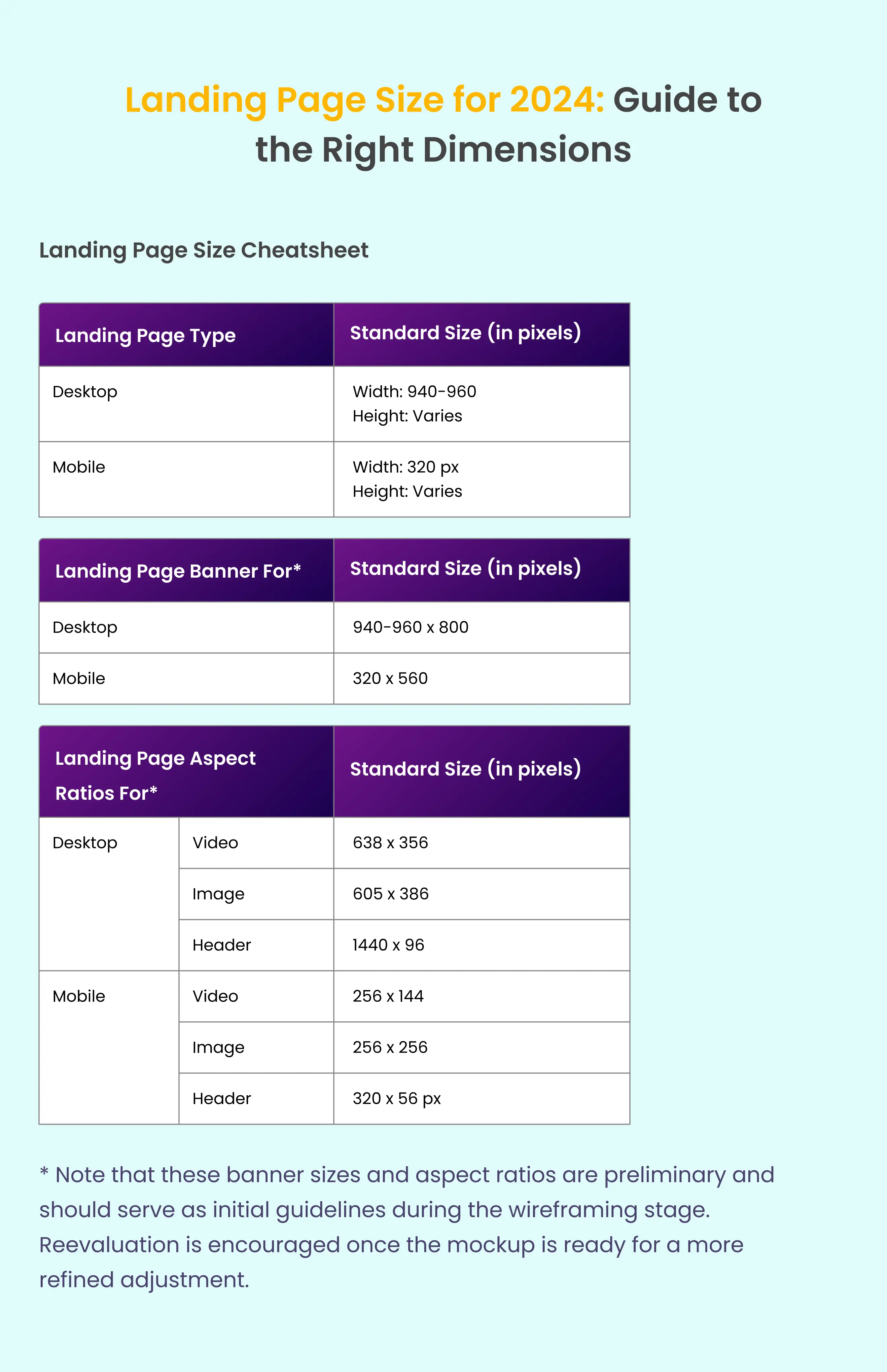
Image Formats
JPEG images are great for photos. They have small file sizes. This helps your site load fast. PNG images are better for graphics. They have clear backgrounds. This is useful for logos or icons. Both formats have their uses. Choose the right one for your needs. Photos? Use JPEG. Graphics? Pick PNG.
WebP is a newer format. It makes files small. This helps your page load quickly. WebP supports both photos and graphics. It saves space without losing quality. Many browsers support WebP. It is a good choice for modern sites. Consider using WebP for better performance.
Resolution And Quality
Images must be clear. But they should not be too large. Large images slow down pages. This hurts user experience. Use images with high resolution. But keep file sizes small. Choose formats like JPEG or PNG. They are good for web use. Reduce the image dimensions if needed. This helps with quick loading.
Image size affects how users see your page. Slow load times can make users leave. Fast loading keeps them engaged. Quality images attract viewers. They make the page look professional. Always check how images appear on different devices. Responsive design is key. Adjust sizes for mobile and desktops. This ensures all users have a good experience.
Responsive Design
Images must fit all screen sizes. Mobile, tablet, and desktop. Use flexible layouts for this. Images should adjust to different devices. They should look clear and sharp.
Choose the right image size. Large images can slow down your site. Smaller images may appear blurry. Use tools to find the balance. Test your site on different devices. This ensures images look good everywhere.
CSS helps in scaling images. Use CSS properties like max-width and height. They keep images from stretching. This maintains their quality.
Another trick is using media queries. They apply different styles for various devices. Images change size based on screen width. Always check image quality after scaling. It should remain high.
Tools For Image Optimization
Images can be large. Use compression tools to make them smaller. TinyPNG and JPEGmini are popular. They shrink images without losing quality. This helps pages load faster. Fast pages are good for websites.
Some tools work online. Others need downloading. Online tools are easy to use. Just upload and compress. Download tools offer more features. Choose what fits best.
Plugins make image tasks easier. Smush is a top choice. It compresses images automatically. EWWW Image Optimizer is another option. It offers many settings. Both plugins save space and speed up sites.
Some plugins are free. Others need payment. Free plugins have limits. Paid ones offer more features. Pick based on needs and budget. Good plugins help websites run smoothly.
Testing And Adjustments
Images can look different on various screens. Phones, tablets, and computers display images differently. It’s important to test on each device. This helps find issues early. Use a responsive design to adjust images automatically. This ensures images fit well. Check how images load on each device. Slow loading can frustrate users. Fast loading improves user experience. Adjust image size for better speed. Smaller sizes load quicker.
Big images can slow a website. Large files take more time to load. Make images smaller for faster loading. Compress images without losing quality. This keeps sites fast and smooth. Use the right format for images. JPEG and PNG are popular choices. They balance quality and size well. Adjust image settings for best performance. Test loading speed after adjustments. Quick websites keep visitors happy.
Frequently Asked Questions
What Size Should Images Be For WordPress Home Page?
Images on WordPress home pages should typically be 1200 x 628 pixels for optimal display. This size ensures fast loading and maintains quality. Remember to compress images for faster site speed. Use JPEG or PNG formats for better compatibility and clarity.
Optimize alt text for SEO benefits.
What Size Should A WordPress Landing Page Be?
A WordPress landing page should ideally be 1200 pixels wide for desktops. Ensure mobile responsiveness with a flexible design, adapting to various screen sizes. Prioritize fast loading times and optimal user experience. Use concise content and engaging visuals to effectively capture visitor attention and encourage conversions.
What Size Should Images Be For WordPress Home Page Slider?
Images for a WordPress home page slider should typically be 1920×1080 pixels. This size ensures optimal quality on most screens. Adjust dimensions based on your theme requirements. Always compress images for faster loading without losing quality. Use JPEG or PNG formats for best results.
What Size Image Is Needed For A Full Screen Website?
A full-screen website image should be at least 1920×1080 pixels. This ensures high-quality display on most screens. Use optimized images to maintain fast loading times. Consider higher resolutions for retina displays, like 3840×2160 pixels, for clearer visuals. Always compress images to balance quality and website performance.
Conclusion
Choosing the right image size for your WordPress landing page is crucial. It ensures a seamless, professional look. Optimal image size balances quality and loading speed. This keeps visitors engaged and satisfied. A full-screen image should be crisp and clear.
Aim for a resolution that fits most screens. Typically, 1920×1080 pixels works well. This resolution provides high quality without slowing your site. Remember, your landing page is often a first impression. A well-sized image enhances user experience. It also boosts your site’s credibility.
Keep experimenting to find what works best for your audience.