Are you looking to create a stunning landing page that not only captures attention but also converts visitors into loyal customers? Photoshop might be your perfect tool.
With its powerful features and flexibility, you can design visually appealing and effective landing pages that resonate with your audience. Imagine having the ability to craft a page that reflects your brand’s unique style while ensuring every element guides your visitors towards taking action.
In this guide, you’ll discover step-by-step how to harness Photoshop’s capabilities to build a landing page that truly stands out. Whether you’re a seasoned designer or just starting, you’ll find practical tips and techniques that can elevate your design skills. Ready to dive into the world of creative possibilities? Let’s get started!
Credit: www.sitepoint.com
Setting Up Photoshop
Begin by downloading Photoshop from the official website. Choose the right version for your computer. Follow the prompts to install it. Make sure you have enough space on your device. The installation process might take a few minutes. Be patient. Once installed, open the application. You are now ready to start creating.
Open Photoshop and go to the Window menu. Select Workspace to choose your preferred layout. Beginners might prefer the Essentials workspace. This layout shows basic tools. Adjust the panels to fit your needs. Save your workspace for future use. A well-organized workspace helps you work faster. It also makes designing more fun.
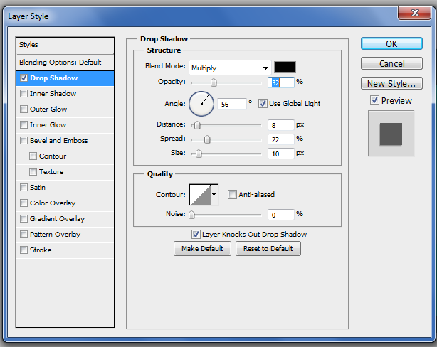
Credit: designlab.com
Planning The Landing Page
A landing page needs a clear purpose. This purpose guides every step. Ask yourself, “What do I want visitors to do?” Maybe sign up for a newsletter. Or download a guide. Keep it simple. Focus on one main goal. This makes the page effective.
Knowing the target audience is key. Who will visit the page? Think about their age. What do they like? Why would they come here? Write it down. This helps design a page they love. Speak their language. Use words they understand.
Start with a sketch. Grab a pencil and paper. Draw the layout. Where will the headline go? What about the images? Plan the buttons. Keep it neat and tidy. Use simple boxes. This helps visualize the page. Adjust as needed. Make it user-friendly.
Design Elements
Colors must be bright and easy to see. Blue and green are friendly choices. They make people feel calm. Red gets attention fast. It makes things stand out. Stick to three colors max. Too many colors can be messy.
Fonts should be simple. Arial and Verdana are easy to read. Big letters help people see important stuff. Use bold for titles. This makes them stand out. Avoid fancy fonts. They can be hard to read. Use two fonts max. It keeps things neat.
Images catch the eye. Use clear and high-quality pictures. People like looking at them. Make sure they match the page’s theme. Too many images can slow down the page. Choose images wisely. Make sure they add value to the text.
Creating The Layout
Start by choosing the right canvas size. Pick a size that fits most screens. A popular choice is 1920×1080 pixels. This gives you enough room for your design. Go to File and select New. Enter the dimensions for the canvas. Make sure the resolution is set to 72 pixels/inch. This is perfect for web designs. Use RGB color mode for bright colors.
Grid lines help you align elements. Go to View and select Show. Click on Grid to make it visible. Adjust the grid settings under Preferences. Choose a grid size that suits your layout. Smaller grids help with precise alignment. Use the grid to keep items neat and organized. It helps make the design look clean. Design will look balanced and professional.
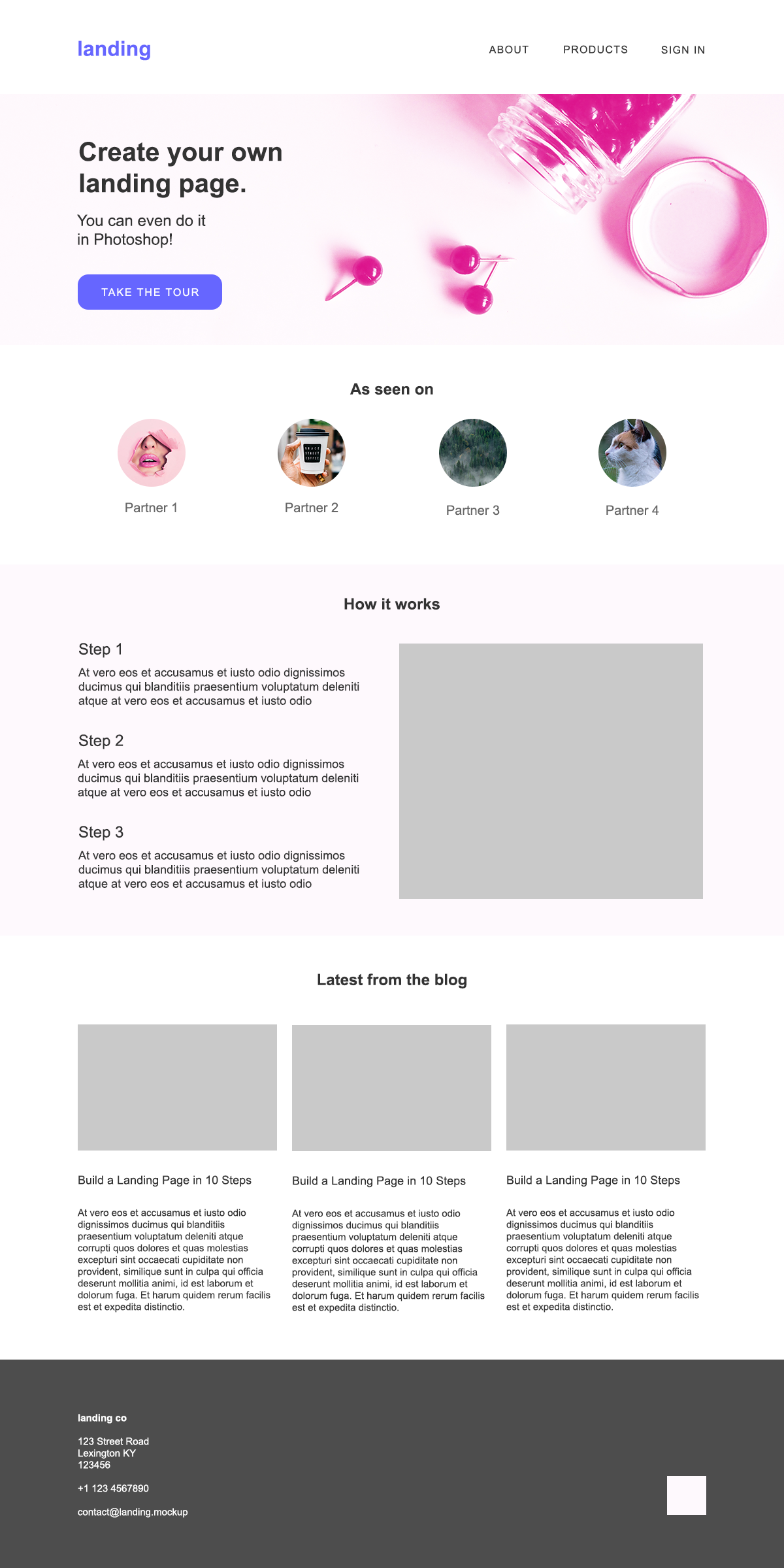
Building The Header
Start with the logo. It should be at the top left. This is where people look first. Make sure the logo is clear and neat. It tells visitors who you are. Use a high-quality image. Do not make it too big. It should fit well in the header. Leave some space around the logo. This helps it stand out more.
The navigation menu is important. Place it next to the logo. Use simple words for each menu item. People should find what they need quickly. Keep it short and easy to read. Use colors that match the logo. This keeps the design clean. Ensure the text is big enough to read. Each menu item should have some space around it.

Credit: www.youtube.com
Designing The Hero Section
Headline text is the first thing visitors see. It should be clear and bold. Use large, easy-to-read fonts. Keep the message short. Make sure it stands out. Colors can help make it pop. Use contrasting colors for best effect.
Call to Action (CTA) is very important. It guides users to act. Use action words like “buy” or “sign up”. Make it visible and attractive. Place it near the headline. Use buttons for easy clicks. Bright colors work well. Ensure it’s easy to understand.
Content Sections
Information blocks give clear details. They help visitors understand your message. Use short sentences. Keep text simple and direct. Add images to support your text. Visuals attract attention. Use bold fonts for key points. Make sure your blocks are easy to read. Divide text into small paragraphs. This keeps readers interested. Use colors that match your brand. Consistent design is vital.
Testimonials build trust. They show real people like your product. Use quotes from satisfied customers. Positive words make a big impact. Keep testimonials short and sweet. Include names and photos if possible. This adds authenticity. Arrange them neatly on your page. They should stand out but not overpower other sections. Let them support your main message. Testimonials are a powerful tool.
Footer Creation
Contact Details are important for any landing page. You should add your email and phone number. This helps people reach out easily. Keep the font simple and easy to read. Make sure the text color contrasts with the background. This makes it more visible. You can also add a contact form. This gives people another way to contact you.
Social Media Links connect your page to your profiles. Add icons for Facebook, Twitter, and Instagram. Place these icons in the footer. This keeps them accessible. Use the same style for all icons. This creates a clean look. People can follow you with one click. It helps grow your audience.
Optimizing For Web
Good image compression is key for fast web pages. Smaller images load quicker. Use tools like Photoshop to compress images. Choose the right compression method. Balance quality and file size. Avoid losing important details. Compressed images should look clear and sharp. Users enjoy fast loading pages. A slow page can make visitors leave.
File Format Selection
Picking the right file format matters. JPEGs are great for photos. They compress well and look good. PNGs work for graphics with transparency. They keep detail but are bigger. GIFs are fun for animations. They have limited colors. Use the format that fits your needs. Each format has strengths. Choose wisely for your landing page.
Exporting The Design
Export your design to share with developers. Use the “Save for Web” option in Photoshop. This creates images that load quickly. Choose the PNG or JPEG format. PNGs are good for quality. JPEGs work for photos. Ensure the design is clear.
Mockups show your design in real life. Use Photoshop to create them. Add your landing page image to a device photo. This helps others see your idea. It makes the design feel real. Use a tablet or phone image. Adjust the size to fit well. Mockups help explain your vision. They are useful tools for presentation.
Frequently Asked Questions
How To Make A Landing Page In Photoshop?
Open Photoshop and create a new document. Design your layout using guides, shapes, and text tools. Add images and graphics. Use layers to organize elements. Save your project as a PSD file. Export the design as JPG or PNG for web use.
Optimize images for fast loading.
What Size Is A Landing Page In Photoshop?
A standard landing page size in Photoshop is 1440 x 1024 pixels. This size ensures optimal viewing across various devices, providing a seamless user experience. Adjust dimensions based on specific design needs and target audience preferences for best results.
How To Create A Landing Page In Adobe?
Start Adobe Illustrator or XD. Choose a blank canvas. Design your layout using shapes, text, and images. Customize colors and fonts. Export your design as a web format or PDF. Add interactive elements in Adobe XD if needed. Test the landing page for functionality and appearance.
Can You Build A Website With Photoshop?
Photoshop cannot build a website directly. It is a design tool for creating website layouts and graphics. To build a website, use coding languages like HTML, CSS, and JavaScript, or website builders. Photoshop designs can be exported and implemented in web development processes.
Conclusion
Creating a landing page in Photoshop is straightforward. Start with a clear goal. Design with the user in mind. Keep the layout simple and clean. Use eye-catching images and colors. Ensure text is readable and concise. Focus on the call to action.
Test your design for usability. Make changes based on feedback. A well-designed landing page boosts engagement. It guides visitors to take action. Remember, practice makes perfect. Keep learning and improving your skills. With time, your designs will shine. Happy designing!