Are you looking to create a landing page that truly captivates and engages your audience? Imagine a page where each visitor finds exactly what they’re looking for, tailored to their unique preferences.
Sounds perfect, right? This is the magic of a landing page with multiple options. It’s not just about design; it’s about understanding your audience’s diverse needs and offering them choices that resonate. In this guide, you’ll discover the secrets to crafting a landing page that not only attracts attention but also converts visitors into loyal customers.
Ready to unlock the full potential of your landing pages? Let’s dive in and explore how you can create compelling, multi-option landing pages that speak directly to your audience’s desires.
Understanding Landing Pages
Landing pages are special web pages. They are made for one purpose. This purpose is to get visitors to act. They might fill a form or click a button. A good landing page helps grow a business. It turns visitors into customers. It is easy to understand and use. This makes it important for online marketing.
Many elements make up a good landing page. A strong headline grabs attention fast. The images must be clear and helpful. The call-to-action button is crucial. It tells visitors what to do next. The text should be short and clear. It should explain benefits well. Trust badges like reviews and testimonials add credibility. A simple design keeps visitors focused.
Planning The Layout
First, know what you want from your landing page. Do you want visitors to sign up? Or maybe download an app? Set clear goals to guide your design. Each goal will need different elements. Make sure every part of the page works toward these goals.
Think about who will visit your page. Young people, adults, or seniors? Knowing your audience helps in choosing the right words and images. Speak their language and use colors they like. This helps in making them feel at home on your page.
Designing For User Experience
The eyes need guidance. They follow a path. Use size to show what’s important. Big things catch attention. Colors help too. Bright colors stand out. Keep the layout simple. Don’t confuse users. Guide them to the right choices. Arrange options by importance. Make sure the most important options are easy to find. Use contrast to highlight. Users should know where to click.
People use different devices. Some have phones. Others have computers. The page must fit all screens. Use a flexible layout. It adapts to screen size. Text must be readable. Buttons should be easy to press. Images should not be too big. Keep everything accessible. Users should not struggle. Make the page load fast. Slow pages lose visitors. Test the page on different devices. Ensure it works everywhere.
Creating Multiple Options
Giving users choices makes them happy. A landing page with many options is smart. Each choice should be clear and easy to find. Use big buttons and short words. Make sure choices are different. Colors can help show different paths. Choices must be simple to understand. Users should feel in control. They should see benefits of each choice. This helps users pick what they want.
Make users feel special. Show them what they like. Use their data to offer better options. Let users choose what fits them best. Ask questions to know them better. Show options based on their answers. This creates a personal touch. Users feel understood and valued. They enjoy their time on the page. This keeps them coming back. Remember, happy users mean success.
Crafting Compelling Content
Headlines grab attention fast. Use simple and clear words. Ask questions or make a promise. Make sure it is related to what you offer. Short and sweet works best. Avoid complex words. Use numbers if possible. People like lists.
Talk to your audience directly. Use “you” to engage them. Focus on benefits, not features. Keep sentences short. Use action words like “buy” or “learn”. Add social proof if you can. People trust others’ opinions. Simple is better. Avoid jargon and big words.
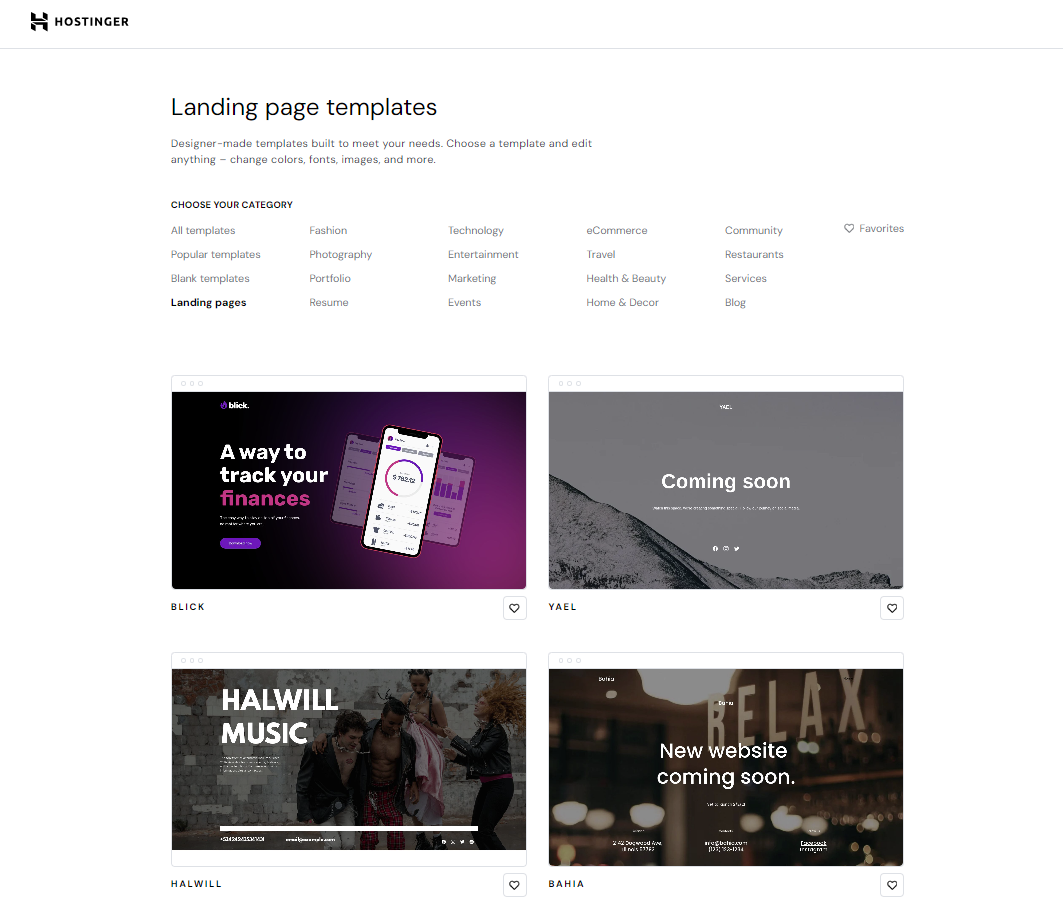
Credit: www.hostinger.ph
Incorporating Effective Ctas
Call-to-Action (CTA) buttons are vital for a landing page. They guide users to take action. Use bright colors for these buttons. Colors like red or green work well. The text should be short and clear. Words like “Buy Now” or “Learn More” help. Make sure the buttons are big enough. Users should not miss them.
Strategic Placement of CTA buttons is key. Place them where users can see easily. Try to put them at the top and bottom. This way, users see them without scrolling. Repeat the button on long pages. This gives users many chances to click.
Optimizing For Seo
Finding the right keywords is important. Use tools to explore popular search words. Think about your topic and what users might search for. Choose keywords that are relevant and have good search volume. Focus on long-tail keywords as they are more specific. This helps in reaching the right audience.
On-page optimization makes your page shine. Add keywords naturally in your content. Make sure your title is catchy and has the main keyword. Use headings to organize your content. Add keywords in headings too. Keep sentences short and easy to understand. A well-organized page helps users and search engines.
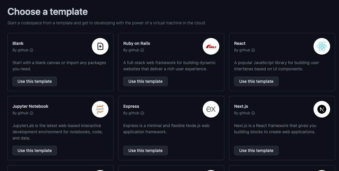
Credit: github.com
Testing And Analyzing
Crafting a landing page with multiple options requires thorough testing and analyzing. Identify what works best by experimenting with different designs, calls-to-action, and content. Analyze user interactions to refine your approach, ensuring a user-friendly experience and better engagement.
A/b Testing
A/B testing helps find the best choice. Create two versions of your landing page. Show one version to half of the visitors. Show the second version to the other half. Compare results from each version. Identify which version gets more clicks or sign-ups. This process helps improve the page. Repeat tests with new changes. A/B tests guide better decisions for your page.
Analyzing User Behavior
User behavior gives important clues. Use tools to track where users click. See how long they stay on the page. Look for patterns in their actions. Find out what interests them most. Adjust your page based on this info. Make changes to improve user experience. Happy users are more likely to stay. Keep analyzing to learn what works best.
Iterating And Improving
Feedback is very important. It helps in making better decisions. Ask users what they like. Also, ask what they do not like. Use surveys and interviews. These tools gather useful information. Keep questions simple and clear. This makes it easy for people. They can give honest answers. Feedback guides the next steps. It shows what to fix or improve.
After gathering feedback, it is time to act. Start with the most important changes. Prioritize based on user needs. Test each change before making it live. This ensures quality. Use simple tools to test. Involve team members in the process. Everyone’s ideas matter. Make changes step by step. This keeps the project on track. Remember, small changes can make a big difference.

Credit: hygraph.com
Frequently Asked Questions
Can A Website Have Multiple Landing Pages?
Yes, a website can have multiple landing pages. Each page targets specific audiences or campaigns, enhancing user engagement and conversions. Multiple landing pages improve SEO by targeting diverse keywords. It allows businesses to cater to different user needs, increasing traffic and leads effectively.
What Are The Three Types Of Landing Pages?
The three types of landing pages are lead generation, click-through, and sales pages. Lead generation pages collect user information. Click-through pages guide users to another page. Sales pages focus on converting visitors into customers. Each type serves a distinct purpose in digital marketing strategies.
What Is The Best Platform To Create A Landing Page?
Choose Unbounce for its user-friendly interface and advanced customization features. Consider LeadPages for marketing-focused tools and templates. Try Instapage for seamless integration and analytics. Explore Wix for its budget-friendly options and design flexibility. Each offers distinct advantages, catering to different needs and preferences for landing page creation.
How Do You Structure A Landing Page?
Create a clear headline, engaging subheading, and persuasive call-to-action. Use concise content and relevant images. Include benefits, testimonials, and contact form. Optimize for mobile and SEO.
Conclusion
Creating a landing page with multiple options increases user engagement. Simple design enhances clarity and user experience. Offer clear paths for different user needs. Test different layouts to find what works best. Keep content concise and valuable. Always prioritize the user’s journey.
A well-structured landing page boosts conversions. Track performance regularly. Make adjustments based on user feedback. A great landing page adapts to user preferences. Focus on providing value and guidance. This ensures users find what they need quickly. Start building your effective landing page today.
Watch your results improve with strategic design.