Are you ready to unlock the potential of your mobile landing pages? Designing a mobile landing page in HTML doesn’t have to be a daunting task.
In fact, with the right approach, it can be a straightforward process that yields impressive results. Imagine having a landing page that captures attention instantly and drives conversions effortlessly. You have the power to create a seamless user experience that keeps visitors engaged and encourages them to take action.
In this guide, you’ll discover simple yet effective techniques to design a mobile landing page that not only looks great but also performs exceptionally well. Whether you’re a seasoned developer or just dipping your toes into HTML, these insights will empower you to craft a page that resonates with your audience. Get ready to transform your ideas into reality and make your mobile landing page a powerful tool in your digital arsenal. Keep reading to find out how you can achieve all this and more, with ease and confidence.
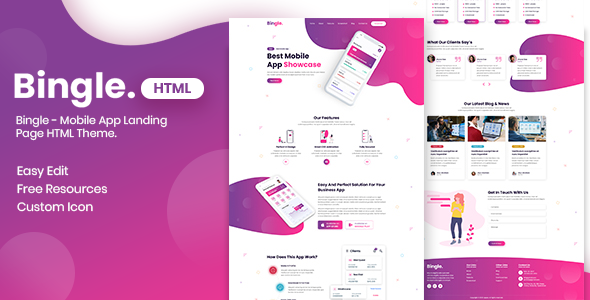
Credit: themeforest.net
Mobile Landing Page Basics
A mobile landing page should be simple. Focus on key goals like capturing leads or selling products. It should load fast. It must be easy to use. Guide visitors with clear directions. Make sure your message is clear.
Images should be bright and clear. Use bold headlines for attention. Buttons must be big and clickable. Text should be short and easy to read. Forms should have few fields. Include contact info for trust. Make sure there is a call to action. Keep the design clean.
Planning The Layout
Designing for mobile is different. Screen space is limited. Content must be simple. Users should find what they want fast. Load time is important. Pages need to load quickly. Buttons should be large. Easy to tap. Text should be readable. Use larger fonts. Images should be clear. Avoid clutter. Keep it clean.
Start with a sketch. Use paper or a digital tool. Outline the main areas. Think about where things go. Navigation at the top. Content in the middle. Call-to-action buttons should stand out. Test the wireframe. Show it to friends. See if they understand it. Feedback helps improve the design. Make changes as needed.
Responsive Design Strategies
Media queries help adjust the design for different screen sizes. They use CSS rules to change styles. This makes the page look good on phones and tablets. Breakpoints are used to define when styles change. These are specific points like 480px or 768px. Use media queries to set styles for each breakpoint. Make sure text and images are readable. This helps users have a good experience. A good experience means happy users.
Flexible grids use percentages instead of pixels. This helps layouts fit various screens. Divide the page into columns. Use CSS to control the width of each column. Make sure columns adjust based on screen size. This keeps the layout clean and organized. Grids help create a balanced design. Balance makes the page look nice.
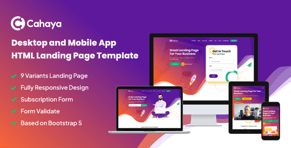
Credit: themeforest.net
Html Structure Essentials
Semantic markup uses HTML tags that describe their meaning. It helps search engines understand content better. Using tags like , and improves structure. This makes your page more accessible. It also enhances the user experience. A well-structured page is easier to navigate. This benefits both users and search engines.
Fast loading times are crucial for mobile pages. Compress images to reduce size. Use CSS and JavaScript wisely. Minimize their usage to speed up loading. Utilize async and defer attributes for scripts. This will prevent blocking the page. Prioritize loading the main content first. Lazy load images for better performance. Users should not wait long for content. Fast pages keep visitors happy.
Designing For Touch
Buttons should be easy to tap. Big buttons are better. Small buttons are hard to hit. A good size is 44×44 pixels. This size works for most fingers. Spacing is important too. Leave space around each button. This helps users tap the right one.
Touch gestures make apps fun. Swiping is a popular gesture. Users swipe to move items. Pinch to zoom is another gesture. This helps see details. Tap and hold can show more options. Users enjoy simple gestures. They make the app easy to use.
Incorporating Visuals
Images must load quickly. Slow images frustrate users. Optimize images for faster loading. Use JPEG for photos. Use PNG for graphics. Compress images without losing quality. Use tools like TinyPNG or JPEGmini. Keep image sizes small. Use responsive images. They adjust to screen size. Serve the right image for each device. Use HTML `` tag with srcset attribute. It helps with responsive images. Ensure alt text is clear. It helps screen readers understand images. Alt text also boosts SEO. Proper image optimization improves user experience.
Embed videos on your page. Use HTML5 `
Enhancing With Css
CSS helps make your page look nice. Use it to change colors, fonts, and sizes. You can make text bigger or smaller. Change the color of links to make them stand out. Add borders to boxes for a neat look. Use padding to give space inside boxes. Margins add space outside boxes. This keeps things from looking too close.
Animations make things move. Use them to make buttons jump or spin. Transitions make changes smooth. They help when a color changes on hover. Transitions can also make sizes change slowly. This makes your page look more professional. But don’t use too many. Too many animations can be confusing. Keep it simple and fun.
Testing And Optimization
Creating a mobile landing page in HTML involves testing and optimizing for user experience. Ensure fast loading times and clear navigation. Adapt design elements to fit smaller screens effectively.
Cross-device Testing
Cross-device testing helps ensure your landing page works everywhere. Phones, tablets, and computers need smooth experiences. Test your page on different devices. Fix any problems quickly. Ensure images and text look good on all screens. Use tools to check how your page looks. Real people can also help. Ask friends to test your page. Listen to their feedback. Make changes if needed. This helps make your page user-friendly for everyone.
Performance Improvement
Improving performance means your page loads fast. Slow pages make users leave. Use small images to speed up load time. Compress files to make them smaller. Check the code for mistakes. Fix them to make it work better. Use caching to store data. This helps load pages faster next time. Keep testing and updating. Performance matters for happy users.
Seo Considerations
Meta tags help search engines. They tell what your page is about. Use keywords that match your content. They help your page rank higher. Keep your meta description short. Make it clear and catchy. It should invite people to visit your page. Use title tags wisely. They should be unique for each page. They are important for SEO.
Mobile users are everywhere. Pages should load fast. Use images that are small in size. They help pages load quicker. Text size is important. It should be easy to read on small screens. Avoid too much text in one block. Break it into smaller paragraphs. Links should be easy to click. Make buttons big enough for fingers. Test your page on different devices. Ensure it looks good on all of them.
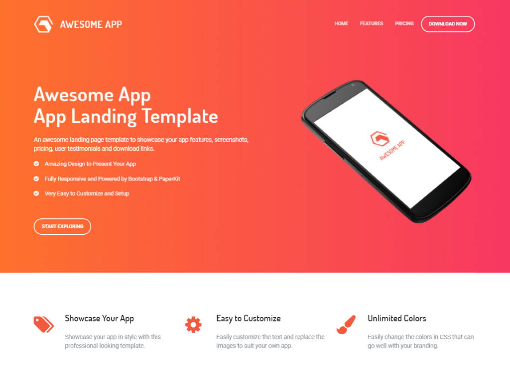
Credit: superdevresources.com
Frequently Asked Questions
How To Make An Html Page Mobile Friendly?
Use responsive design techniques like CSS media queries. Set viewport meta tags for scaling. Utilize flexible layouts and images. Implement touch-friendly navigation. Test on multiple devices to ensure compatibility and user-friendly experience.
How To Create A Landing Page With Html?
Start by creating an HTML file. Use for title and metadata, for content. Add