Are you struggling to capture the attention of mobile users with your landing page? You’re not alone.
In a world where people are constantly scrolling on their smartphones, designing a HTML mobile landing page that stands out is crucial. Think about it: your landing page is often the first impression you make on potential customers. You want it to be not only visually appealing but also highly functional.
Imagine the satisfaction of knowing that your landing page is converting visitors into loyal customers. You can achieve this by understanding the essentials of mobile design and applying them effectively. This article will guide you step-by-step through the process, ensuring that you design a landing page that is not just another click, but a lasting impression. Dive in and discover how you can transform your mobile landing page into a powerful tool for engagement and conversion.
Planning Your Mobile Landing Page
Crafting a mobile landing page in HTML involves choosing a clean design and responsive layout. Focus on fast loading times and easy navigation to enhance user experience. Clear call-to-action buttons and concise content help capture attention on smaller screens.
Identifying Your Goals
Start by knowing what you want. Do you want more sign-ups? Or maybe more people to buy? Clear goals help you focus. Focused pages work better. Keep the goals simple and clear. Simple goals are easier to reach.
Understanding User Needs
Users like pages that are easy to use. Make sure your page loads fast. Fast pages keep users happy. Happy users stay longer. Think about what users want. Give them what they need. User-friendly design is key.
Researching Competitors
Look at what others are doing. See what works for them. Learn from their mistakes. Compare their design to yours. Good research helps you improve. Better pages attract more users. Use what you learn to make your page better.
Design Principles For Mobile
Keep the design clean and simple. Too much clutter makes users confused. Simple designs load faster on mobile devices. Focus on one main action. Remove unnecessary elements to maintain clarity.
Choose easy-to-read fonts for your text. Large font sizes help users read easily. Make sure there is enough contrast between text and background. Short sentences are better for quick reading. Avoid complex words and phrases.
Use clear labels for buttons and links. Easy navigation helps users find what they need. Ensure the menu is simple to use. Test your navigation on different devices. Icons can help, but they should be clear and understandable.
Choosing The Right Html Framework
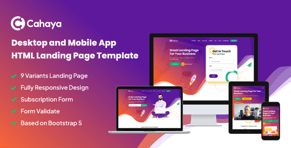
Bootstrap is great for responsiveness. It helps make pages look good on all devices. It has many tools and templates. These save time and help with design.
Foundation is known for its flexibility. It allows more control over designs. It is good for custom needs. It offers many features to explore.
Tailwind CSS offers customization. It uses utility classes. This gives more power to style pages. It helps make unique and beautiful designs.
Credit: themeforest.net
Crafting Engaging Content
Short and simple sentences make reading easy. Use words that kids can understand. Keep sentences under 12 words. This helps the reader stay focused. Use clear and direct language. Avoid complex phrases. Make your point quickly. This holds the reader’s attention. Every word should add value. No word should be wasted.
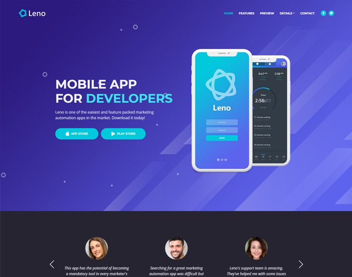
Pictures and icons catch the eye. They help tell the story without words. Keep visuals simple. They should not confuse the reader. Colors should be pleasing. Bright colors may help focus. Use images to guide. They point to important information. Visuals should support text. Together, they tell the full story.
Guide the reader with clear steps. Use buttons and links to direct actions. Make actions easy to find. They should stand out. Words should be easy to read. Use short action words. Tell the reader what to do next. This helps them act. Calls to action should be simple. Do not confuse the reader.
Optimizing For Performance
Fast pages make users happy. Use smaller images. They load faster. Compress files to save space. Minimize CSS and JavaScript. This helps pages load quickly. Keep your design simple and clean. It improves speed. Every second counts.
Lazy loading helps pages load faster. Only show images when needed. This saves data. Users see content quickly. It’s smart for mobile users. They use less data. It improves user experience. Save time and data. Users will be happy.
Browser caching stores files locally. Users load pages faster. It reduces server requests. Save time and bandwidth. Set cache for images, CSS, and scripts. This keeps your site fast. Users return for quick loading pages. They enjoy the speed.
Credit: www.landingfolio.com
Testing And Iterating
Experiment with your HTML mobile landing page design to find what works best. Test different elements like color, text, and buttons. Make changes based on feedback to improve user experience and engagement.
Conducting User Testing
Gather a group of users. Ask them to use the landing page. Watch how they interact with it. Note any difficulties they face. Collect their opinions on the design. This process helps you see the page through their eyes. It shows what works and what doesn’t.
Analyzing Feedback
Go through the user comments. Look for common themes. Identify areas needing improvement. Feedback provides valuable insights. It highlights user preferences. It points out confusing features. This helps refine the design.
Making Necessary Adjustments
Use the feedback to make changes. Simplify complex features. Improve navigation if needed. Ensure the page loads quickly. Adjust colors for better visibility. Test changes with users again. See if it solves previous issues. This process ensures a better user experience.
Seo Best Practices For Mobile
Mobile-friendly tags help pages look good on phones. Use viewport tags. These tags make text and images fit right. Responsive design is key. It changes layout based on screen size. Avoid using fixed widths. They don’t adjust well. Make sure buttons are easy to tap.
Meta descriptions tell search engines about your page. Keep them short and clear. Use keywords wisely. Keywords must be in natural sentences. Make sentences easy to read. This helps visitors know what to expect. Good descriptions improve click rates.
Fast pages keep users happy. Compress images for quicker loads. Minimize scripts that slow pages down. Use browser caching. It saves resources. Users don’t wait long. Page speed helps with SEO. Search engines like fast sites. Better speed means better ranking.
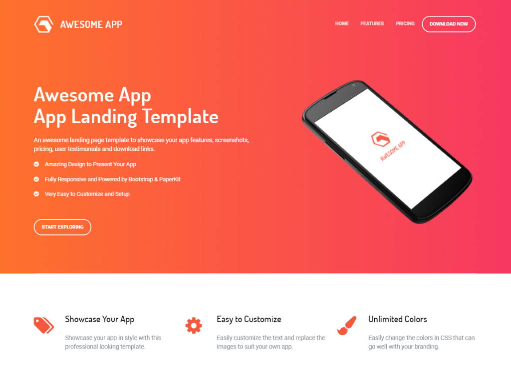
Credit: superdevresources.com
Frequently Asked Questions
How Do I Make My Html Page Mobile Friendly?
Use responsive design with CSS media queries. Ensure a flexible layout with percentage-based widths. Implement viewport meta tags for proper scaling. Optimize images for faster loading. Test on various devices for compatibility.
How To Create A Landing Page With Html?
Start with a basic HTML structure. Use `
How To Make A Landing Page In Mobile?
To create a mobile landing page, use responsive design tools. Optimize images and reduce loading time. Focus on clear, concise content and strong calls-to-action. Ensure easy navigation with mobile-friendly layouts. Test across different devices for functionality and appearance.
How To Create Html Web Page In Mobile?
Use a code editor app like AIDE or Jota on your mobile. Create a new file, type HTML code, and save it as. html. Use a browser to view the page.
Conclusion
Creating a mobile landing page in HTML is essential today. Focus on user-friendly design. Keep navigation simple and intuitive. Ensure your page loads quickly. Use responsive design to fit all screen sizes. Test your page on different devices. This helps identify any issues.
Make your content engaging and concise. Include clear calls to action. Optimize images to reduce load times. Remember, a well-designed page boosts user experience. This can lead to higher engagement and conversions. Stay updated with design trends. This keeps your landing page fresh and relevant.
Happy designing!

