Imagine this: you’ve crafted the perfect email campaign. Your message is compelling, your call to action is clear, and your design is stunning.
Yet, when your audience opens your email on their mobile device, they struggle to read it. Why? Because the font size is too small. In the fast-paced world of email marketing, capturing your reader’s attention within seconds is crucial. So, how do you ensure your message is not only seen but also read and acted upon?
It all starts with choosing the right font size for mobile devices. This seemingly small detail can significantly impact how your audience interacts with your content. Stick around, and you’ll discover exactly why font size matters and how you can optimize it to boost engagement and drive conversions.
Importance Of Font Size In Mobile Emails
Email marketing remains a powerful tool for connecting with your audience. But did you know that the font size you choose can make or break your campaign, especially on mobile devices? It’s true. The right font size ensures readability, keeps your message clear, and engages your reader effectively. You want your emails to be easy to read and visually appealing, right? Let’s dive into why font size matters so much in mobile emails.
Most of us check emails on our phones, often while multitasking. Imagine squinting at tiny text while juggling your morning coffee. Not ideal, right? A font size that’s too small can frustrate users, causing them to abandon your email. This can lead to missed opportunities and reduced engagement.
The ideal font size for mobile emails is typically between 14px to 16px for body text. This range ensures that your email is readable without needing to zoom in. It helps maintain the flow of your message and keeps your audience engaged with your content.
On the flip side, a font that’s too large can overpower your message, making it difficult to grasp. It’s all about finding that sweet spot. Have you ever received an email where the text felt like it was shouting at you? Not the best experience, right?
Consider Your Audience
Your audience’s age and preferences can impact font size choices. Older readers might appreciate slightly larger fonts, while younger audiences might prefer something sleek and compact. Tailoring your font size can make your emails more personal and welcoming.
Think about your own experiences. Have you noticed how different brands use different font sizes? Some cater to professional settings with smaller fonts, while others opt for larger fonts to grab attention instantly.
Test And Optimize
Testing different font sizes can reveal what works best for your audience. Try A/B testing with varied font sizes to see which gets better engagement. You might be surprised by the results.
Consider asking yourself: Have you ever adjusted your email strategy based on font size feedback? Making small changes can lead to significant improvements in reader interaction.
Keep Consistency Across Devices
It’s crucial to ensure that your emails look consistent, whether viewed on a mobile or desktop. Consistency builds trust and enhances user experience. You don’t want your emails to look jumbled on different devices, do you?
Have you considered how your emails appear across various screen sizes? Maintaining a consistent font size can prevent your message from getting lost in translation.
In the end, the right font size in mobile emails can make a world of difference in how your audience perceives your message. It’s not just about looking good—it’s about ensuring your message is accessible and engaging. So, are you ready to optimize your email campaigns with the perfect font size?
User Experience Considerations
Email marketing on mobile devices is about more than content. User experience is key. The font size in your emails greatly affects readability. It’s crucial for engagement. Let’s explore essential user experience considerations.
Font Size And Readability
Font size directly impacts readability on mobile screens. A small font can strain eyes. Choose a font size that is easy to read. Consider using at least 14px for body text. Larger fonts improve comprehension.
Accessibility Matters
Accessibility should be a priority. Some users have visual impairments. A larger font size helps them read your emails. Ensure your emails are inclusive. This enhances user experience for all.
Device Diversity
Emails are viewed on various devices. Each device has different screen sizes. Test your email on multiple devices. This ensures consistent readability across platforms. Consistency boosts user satisfaction.
Visual Hierarchy
Visual hierarchy guides readers. Use different font sizes for headings and body text. Larger headings draw attention. They help organize content clearly. This makes emails easier to navigate.
Design Balance
Balance is crucial in design. Avoid overcrowding your email with text. Ensure there is enough spacing around text. This makes reading comfortable. A well-spaced email enhances user experience.
Optimal Font Size Recommendations
Choosing the right font size for mobile emails ensures readability and engagement. Aim for a minimum of 14 pixels for body text. Headers should be slightly larger, around 20 pixels, for clear emphasis.
When designing email marketing campaigns, choosing the right font size is crucial for readability and engagement, especially on mobile devices. With limited screen space, your message must be clear and easy to read without requiring your audience to zoom in. Let’s dive into some optimal font size recommendations to ensure your emails are both visually appealing and effective on mobile screens.What Is The Ideal Font Size For Body Text?
For body text, a font size of 14 to 16 pixels is generally recommended. This range strikes a balance between readability and space, ensuring that your content is easily consumed without overwhelming the screen. Remember the last time you received an email with tiny text? It was probably frustrating to read, right? Avoid this by keeping your body text comfortable for the eyes.How Big Should Headers Be?
Headers in your email should be noticeably larger than the body text to create a clear hierarchy. Aim for a font size of 20 to 24 pixels. This helps grab attention and guides the reader through the content logically. Think of it like a newspaper headline that draws you into the article. A clear header can make your email much more inviting.Why Is Line Spacing Important?
Line spacing is often overlooked but plays a vital role in readability. A spacing of 1.5 to 1.75 is typically best for email content. This prevents the text from looking cramped and makes it easier for readers to follow along. Have you ever tried reading a dense block of text without enough space? It can be a real strain on the eyes.Should You Use Different Fonts For Mobile And Desktop?
While consistency is key, some adjustments might be necessary for mobile. Sans-serif fonts like Arial or Helvetica are generally more readable on smaller screens. These fonts have clean lines that enhance clarity, unlike serif fonts, which may appear cluttered on mobile devices. Test your font choices across different devices to ensure readability for all users.How Can You Test Font Sizes?
Testing is crucial to determine what works best for your audience. Before sending out your email, preview it on various mobile devices. Consider how easy it is to read the text, and whether the headers stand out. You might find that what works on one device doesn’t on another, so continuous testing and adjustments are necessary.Remember, the ultimate goal is to make your emails as reader-friendly as possible. Have you ever adjusted your font size and seen improved engagement? Share your experience and see how these adjustments can transform your email marketing strategy.Impact On Readability And Engagement
Email marketing needs clarity. Font size plays a crucial role. It affects how easily people read your message. Small fonts can frustrate readers. Large fonts might overwhelm them. Finding the right balance is key.
Font Size And Readability
Readers use mobile phones often. Small screens demand proper font sizes. A good size enhances readability. It reduces eye strain. It helps readers understand your message quickly. It guides them through the content smoothly.
Engagement Through Better Visibility
Visibility boosts engagement. People engage more when they can read easily. Proper font size increases interaction. It encourages people to click links. They respond to calls to action when text is clear.
Font Size Recommendations
Industry experts suggest 14 to 16 pixels for mobile emails. This range offers comfort and clarity. It allows for easy reading. It ensures key messages stand out. Test different sizes to find what works best.
Testing And Adjusting Font Size
Every audience is unique. Some may prefer larger fonts. Test various sizes regularly. Observe engagement rates. Adjust fonts based on feedback. Aim for readability and engagement with each campaign.
Balancing Aesthetics And Functionality
Choosing the right font size for email marketing on mobile is crucial. A font size of 14-16 pixels ensures readability and maintains a visually appealing design. Balancing aesthetics and functionality helps engage readers effectively.
Balancing aesthetics and functionality in email marketing is crucial. Striking the right balance ensures emails are visually appealing and easy to read. Aesthetic elements draw attention. Functionality ensures the message is received clearly. While designing for mobile, font size plays a vital role. It impacts both readability and design appeal.Choosing The Right Font Size
Selecting the appropriate font size is essential. It affects how users perceive your email. A font that’s too small can be difficult to read. A font that’s too large might overwhelm the design. 16px is often recommended for body text. It provides a comfortable reading experience on mobile devices.Enhancing Readability
Clear, readable text enhances user engagement. Users quickly scan content on mobile devices. Larger fonts improve readability on small screens. They make the text more accessible to all readers. Choosing an appropriate font size can reduce bounce rates. It keeps readers engaged with your content.Maintaining Design Appeal
Design appeal is crucial for grabbing attention. Balanced font size contributes to a neat layout. It complements design elements without overpowering them. Proper spacing between text lines can enhance aesthetics. Consistency in font sizes across devices maintains a cohesive look.Testing Across Devices
Testing is key to ensuring optimal display. Different devices might render fonts differently. Test emails on various mobile devices. This ensures font sizes are consistent and readable. User experience improves with thorough testing. It leads to higher engagement and conversion rates.
Credit: onesignal.com
Testing And Adjustments
Choosing the right font size for email marketing on mobile is crucial. A font size of 14-16 points ensures readability and engagement. Testing and adjustments help to find the perfect balance for different devices.
In the world of email marketing, crafting the perfect message is only half the battle. Ensuring that your audience can read your emails effortlessly, especially on mobile devices, is crucial for engagement. This is where testing and adjustments come into play. You can’t simply set a font size and assume it will work for everyone. It’s about finding that sweet spot where readability and design meet. Let’s dive into how you can effectively test and adjust your email font size for mobile devices.Understanding Your Audience
Who are you writing to? Different audiences might have different preferences and needs. A younger audience might appreciate a smaller font that allows for more content on the screen. Older demographics might need larger fonts for better readability. Always keep your audience in mind when testing font sizes.Conducting A/b Tests
One effective method to find the right font size is A/B testing. Create two versions of your email with different font sizes and send them to a small segment of your audience. Track the engagement rates. See which version gets more clicks and responses. This will give you a clearer picture of what works best for your audience.Checking Across Devices
Your email might look perfect on your phone, but what about on other devices? It’s vital to test how your email appears on various smartphones and tablets. Use tools or services that provide previews of how your email looks on different devices. This helps ensure a consistent experience for all your readers.Gathering Feedback
Sometimes, the best insights come directly from your audience. Encourage feedback on your emails. Ask your readers if they find the text easy to read. This direct feedback can be invaluable in making necessary adjustments.Making Incremental Changes
Avoid drastic changes. If you find that your current font size isn’t working, make small adjustments. Increase or decrease the size slightly and observe the results. Small, incremental changes help you zero in on the ideal font size without alienating your audience.Utilizing Analytics
Use analytics to inform your decisions. Look at open rates, click-through rates, and bounce rates. A sudden drop in engagement could indicate a problem with readability. Use this data to guide your font size adjustments.Experimenting with different font sizes is essential, but it doesn’t end there. Continually testing and adjusting your approach based on data and feedback ensures your emails remain effective and engaging. What strategies have you found effective in optimizing your email content for mobile users?Common Mistakes To Avoid
Choosing the wrong font size for mobile emails can reduce readability. Many make the mistake of using fonts smaller than 14 pixels. Ensure your text is clear and easy to read to keep your audience engaged.
When crafting emails for mobile devices, choosing the right font size is crucial. Many marketers overlook this detail, leading to emails that are difficult to read and engage with on smaller screens. To ensure your email campaigns are effective, it’s essential to avoid some common mistakes. Let’s dive into these pitfalls and how you can steer clear of them.1. Using Tiny Fonts
Tiny fonts might look sleek on a desktop, but they can be a nightmare on mobile screens. If your recipients need to zoom in to read, they might just skip your email altogether. A good rule of thumb is to keep the font size at least 14px for body text and 22px for headers. This ensures readability without straining your reader’s eyes.2. Ignoring Font Style
Not all fonts are created equal. Choosing a fancy or overly decorative font can make your emails hard to read. Stick to simple, clear fonts like Arial or Helvetica. They’re universally readable and look professional. Have you ever struggled to read a cursive font on your phone? Avoid putting your readers in that position.3. Overlooking Line Spacing
Line spacing can make or break the readability of your emails. Too tight, and it feels cramped. Too loose, and it looks unprofessional. Aim for a line spacing of 1.5 for optimal readability. This small adjustment can make your content much easier to digest.4. Forgetting To Test On Different Devices
How often do you send out an email without checking how it looks on a phone? Testing is crucial. An email that looks perfect on your desktop might appear jumbled on a mobile device. Use tools that allow you to preview your email on various screen sizes. It’s a simple step that can save you from major embarrassment.5. Neglecting User Preferences
Everyone has their own preferences when it comes to reading emails. Some might prefer a larger font size due to visual impairments. Consider allowing subscribers to adjust the font size in your emails. This small personalization effort can significantly improve user experience.By being mindful of these common mistakes, you can enhance the effectiveness of your mobile email marketing. You want your message to be received loud and clear, not lost in unreadable text. Are you ready to make your emails more user-friendly?
Credit: designmodo.com
Future Trends In Mobile Email Design
Mobile email design is evolving rapidly. With the rise of smartphones, designers face new challenges. Emails must be clear and easy to read on small screens. The future brings exciting trends that will shape mobile email design.
Responsive Font Sizes
Font size plays a crucial role in mobile email design. Designers are now opting for responsive fonts. This means font size adjusts to screen size. It ensures emails are readable on all devices. This trend will continue to grow as more people use mobile phones.
Adaptive Color Schemes
Color schemes are becoming adaptive. Emails will change colors based on user settings. Dark mode compatibility is essential. It enhances readability and user experience. Expect more emails to support adaptive colors.
Interactive Elements
Interactive elements are gaining popularity. Buttons and links must be easy to click. Designers are adding animations and interactive features. This makes emails more engaging and user-friendly. Interactive elements will become a standard in mobile email design.
Minimalist Layouts
Minimalist layouts are trending. Simple designs load faster and are easier to navigate. Less clutter means more focus on key messages. Designers are simplifying layouts to enhance readability. This approach will continue to dominate mobile email design.
Personalized Content
Personalized content is becoming crucial. Emails tailored to individual preferences attract attention. Algorithms can customize content for each user. This trend is set to increase engagement. Expect more personalized emails in the future.
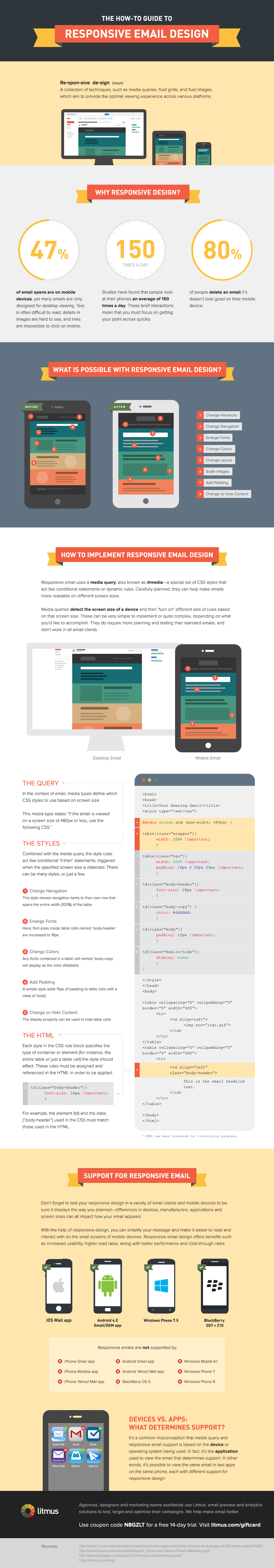
Credit: www.litmus.com
Frequently Asked Questions
What Is The Best Font Size For Mobile Email?
The best font size for mobile email is 14px for body text. This ensures readability on smaller screens. Use 22px for headings to make them stand out. Maintain a clean and professional look by avoiding overly decorative fonts. Always test on multiple devices for optimal results.
What Size Should Mobile Email Marketing Be?
Optimize mobile email marketing by using a width of 320-600 pixels. Ensure concise, clear content for easy reading. Use responsive design to adapt to various screen sizes. Enhance engagement with short subject lines and compelling visuals. Prioritize readability and user-friendly layouts for effective communication.
Is 12px Too Small For Mobile?
Yes, 12px is generally too small for mobile screens. Larger font sizes improve readability and user experience. Aim for at least 14px for body text on mobile devices. This ensures easy reading and accessibility, enhancing engagement and satisfaction.
What Is The Recommended Font Size For Mobile?
The recommended font size for mobile is 16px for body text. This ensures readability and accessibility across devices. Larger fonts improve user experience and engagement, while smaller fonts may strain the eyes. Adjust font size according to design needs, but prioritize clarity and ease of reading for mobile users.
Conclusion
Choosing the right font size is crucial for mobile email marketing. It ensures readability and keeps your audience engaged. A font size of 14-16 pixels works well for most users. It makes text clear without overwhelming the screen. Test your emails on different devices.
This checks if your message looks good everywhere. Remember, clear communication builds trust. It enhances user experience. Pay attention to font size, and your emails will be effective. Simple changes can improve engagement significantly. Keep these tips in mind for your next email campaign.