Are you wondering how to make your landing page more visually appealing? You’re not alone.
Every click on your website is a chance to impress, engage, and convert visitors into loyal customers. But if your landing page doesn’t captivate their attention immediately, they might click away before you get a chance to shine. You deserve a landing page that not only looks great but also drives results.
Imagine your visitors feeling an instant connection with your brand, compelled to explore further. This is possible with a few strategic tweaks. By understanding how colors, layout, and design elements affect your audience’s emotions and decisions, you can transform your landing page into a powerful tool that captures interest and encourages action. Let’s dive into the secrets of creating a visually stunning landing page that holds your visitors’ gaze and keeps them coming back for more.
Design Principles
Balance in design is like a seesaw. Both sides should look equal. Proper alignment makes your page neat. It helps users find information fast. Use grids to align text and images. This will make your landing page look tidy and organized.
Contrast helps important parts stand out. Use bold colors for main buttons. This makes them easy to see. Hierarchy guides the eye. Make main titles big. Smaller text for details. Users will understand your page better.
Whitespace is not empty space. It gives eyes a rest. Keep some space around text and images. It makes your page look clean. Less clutter means more focus on the message. Good whitespace improves reading. Users will stay longer on your page.

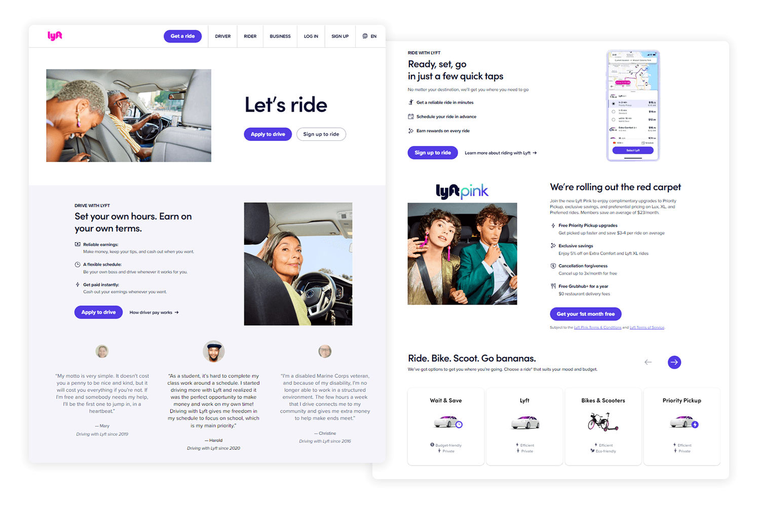
Credit: unbounce.com
Color Schemes
A good palette can make your page stand out. Pick colors that match your brand. Use no more than three main colors. Too many colors can confuse visitors. Simple palettes are easy on the eyes.
Colors should match your brand’s look. This helps people remember you. Use the same colors as your logo. Consistency builds trust with your audience. People feel more connected to brands they recognize.
Colors can change how people feel. Blue feels calm and safe. Red can show excitement or urgency. Think about what you want visitors to feel. Choose colors that fit your message. This will make your page more effective.
Typography Choices
Choose fonts that work well together. This creates harmony on the page. Sans-serif fonts are clean. Serif fonts feel classic. Combine these for contrast. Use two or three fonts only. Too many can confuse viewers. Match the mood of your brand. This helps build trust.
Text should be easy to read. Use large font sizes for headers. Small text is hard to read. Keep lines of text short. This helps eyes follow easily. Color contrast is important. Dark text on light background works well. Ensure screen readers can read your text. This aids accessibility.
Bold important words. This draws attention. Use italics for subtle emphasis. It adds variety. Underline sparingly. It can distract. Avoid over-styling. Too much can overwhelm. Consistent styling is key. This keeps the page neat. Style should enhance the message.
Credit: www.justinmind.com
Imagery And Graphics
Choose clear and bright images for your landing page. Ensure images fit your theme. Use pictures that tell a story. Make sure images load fast. Slow images can make visitors leave. Use the right size. Big images can slow down your page. Small images may not look good.
Use simple icons that are easy to understand. Icons help guide users. Use illustrations to show ideas. Illustrations can explain better than words. Keep them neat. Do not clutter with too many icons. Choose colors that match your page theme.
Videos grab attention quickly. Use short videos to explain things. People love watching videos. Make sure videos load fast. They should not buffer. Place videos where users can see them. Do not use too many videos. It can slow the page down.
User Experience
Users love easy paths. Keep menus short and simple. Limit choices to five or less. Use clear labels. Help users find what they need fast. Avoid complex words in navigation. Make sure links work. Check often. Users feel happy with easy clicks.
Slow pages make users leave. Fast loading keeps users happy. Compress images to make them smaller. Reduce file sizes. Use less fancy scripts. Optimize your code. Check page speed online. Fix any slow spots. Keep your site fast and smooth.
Phones, tablets, and computers. Your site must fit them all. Use responsive design to adjust layouts. Check your site on different screens. Make sure text and images fit. Users should not need to zoom. Keep buttons big enough to click. Ensure a smooth experience across devices.
Call To Action Design
Buttons should be easy to find. Place them where people look first. The top of the page works well. Center buttons for more attention. Put them near important text. This helps users take action quickly.
Bright colors catch the eye. Use colors that stand out. Red and orange work well. Size matters too. Bigger buttons are easier to click. Make sure they fit the page. Not too big, not too small. Just right.
Keep text simple and clear. Short words are best. Use action words like “Buy” or “Click.” Make text large enough to read. Choose fonts that are easy to see. Avoid fancy styles. Clarity is key.
A/b Testing
Experimenting with Layouts can be fun and useful. Try different designs. See what works best. Some layouts might be more attractive. Others might be easier to use. Switching things up is key. A fresh design can catch the eye. But don’t change too much at once.
Testing Color Variations is important. Colors can make people feel things. Some colors are calming. Others grab attention. Try using different shades. Maybe a blue button works better. Or a red banner stands out more. Keep testing to find the best mix.
Analyzing User Feedback helps improve your page. Users know what they like. Their feedback is a gift. Ask them what they think. Listen to their suggestions. What do they find easy? What is confusing? Make changes based on this feedback. Happy users mean a better page.

Credit: unbounce.com
Frequently Asked Questions
How Do I Make My Landing Page Interesting?
Create engaging headlines and include high-quality visuals. Provide clear calls to action and concise content. Optimize for mobile devices and ensure fast loading times. Use testimonials and social proof to build trust.
How Do You Get People To See Your Landing Page?
Promote your landing page using social media, email marketing, and SEO optimization. Engage visitors with compelling content. Use targeted ads for increased visibility. Collaborate with influencers to reach broader audiences. Analyze traffic using analytics tools for continuous improvement.
How Do I Improve My Landing Page?
Enhance your landing page by optimizing loading speed, using clear calls-to-action, and incorporating engaging visuals. Utilize SEO best practices, such as relevant keywords and meta tags. Ensure mobile responsiveness and A/B test elements for better performance. Make content concise and user-focused for improved conversions.
How Do You Style A Landing Page?
Use a clean, minimal design with engaging visuals. Ensure clear, concise messaging with strong headlines. Optimize for mobile responsiveness. Include compelling calls-to-action and social proof. Keep navigation simple to focus on conversion.
Conclusion
Creating a visually appealing landing page is vital. It attracts visitors and keeps them engaged. Use vibrant colors that match your brand. Choose clear, readable fonts. Include high-quality images to draw attention. Keep the layout clean and simple. This helps users navigate easily.
Test your page on different devices. Ensure it looks good everywhere. Remember, a well-designed page boosts user experience. It can lead to more conversions. Aim for simplicity and clarity in design. Always think about the user’s journey. Make your landing page a pleasant experience for all visitors.