Have you ever wondered why Apple’s landing pages grab your attention instantly? It’s not just about sleek designs or high-resolution images; there’s a subtle science behind it.
Imagine landing on a page that speaks directly to you, understanding what you need before you even realize it. That’s the magic of Apple’s design strategy. By the end of this article, you’ll uncover the secrets behind Apple’s captivating landing pages and learn how they can transform your own digital presence.
Don’t miss out on discovering techniques that can make your website irresistible. Dive in to see how Apple turns visitors into loyal fans, and how you can do the same for your audience.

Credit: www.figma.com
Design Philosophy
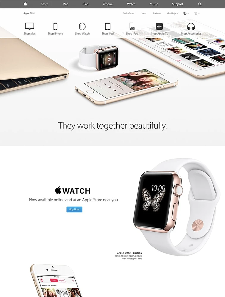
Apple loves simple designs. They keep their pages clean. You will see a lot of white space. This helps focus on what is important. Words are few, but powerful. Pictures are big and clear. They tell a story without using many words.
Apple’s pages are easy to use. You can find things fast. Buttons are big and easy to click. Navigation is smooth. Every detail is for the user. This makes the experience enjoyable. Kids can use it with ease. Adults too.

Credit: www.figma.com
Visual Elements
Apple uses clean and simple fonts on their pages. This makes reading easy. The letters are clear and bold. They are not too fancy. People can understand them fast.
Different sizes of text show importance. Big letters catch your eye. Small letters give more details. This helps guide the reader.
Apple loves using white space. This makes their products pop. Colors are calm and not too bright. This keeps the page neat.
Images are clear and sharp. They show real-life uses. This helps people imagine using the products. Photos are high quality. They add to the page’s beauty.
Content Strategy
Apple knows how to grab your attention. Their headlines are simple and clear. Each word is chosen with care. The message stays in your mind. Headlines tell you what is important. They make you want to read more.
Apple’s headlines are often short. This makes them easy to understand. They use words that many people know. This helps everyone get the message. Apple’s goal is for everyone to feel included.
Every Apple page tells a story. Each story is easy to follow. You feel like you are part of it. The story is about how the product helps you.
Apple uses pictures and words together. This makes the story more real. You can see the product in action. This way, you understand how it works. Stories make the product feel special. They make you want to learn more.
Credit: www.lapa.ninja
Technical Aspects
Apple’s landing pages work on all devices. Phones, tablets, and computers. They use flexible grids and layouts. This helps adjust the page size. Images and text change size too. Everything looks good. No matter the screen size. This is called responsive design. It helps users have a better experience.
Fast pages are important. Apple uses techniques to make pages load quickly. They compress images. This makes them smaller. Minified code helps too. It makes files smaller. Faster loading means happy users. They stay longer on the site. Efficient caching is used. It stores data to speed up loading. Faster pages mean more visitors.
User Engagement
Apple uses fun ways to keep users engaged. Their landing pages have sliders and pop-ups. These features make users want to stay longer. Users can click and see more. This keeps their interest high. Users enjoy exploring these features. They feel like they are playing.
Apple places call-to-action (CTA) buttons smartly. Users see them at the top. They also find them at the bottom. Users can easily click these buttons. This helps users decide quickly. The buttons are easy to see. They have bright colors. This makes users want to click.
Testing And Iteration
Apple focuses on clean design and user-friendly layouts for their landing pages. They test different styles to see what works best. By analyzing user feedback, they refine and improve the pages continuously. This careful process ensures an engaging experience for every visitor.
A/b Testing
A/B Testing is crucial for Apple. They compare two versions of a page. This helps find which one performs better. Small changes can make a big difference. Colors, buttons, or text are tested. The goal is to improve user experience. Each test provides valuable data. This data guides future decisions.
Feedback Integration
Apple values user feedback. Feedback helps improve landing pages. Users say what they like or dislike. Apple listens and makes changes. Feedback is key to understanding user needs. It helps Apple stay ahead. Pages become more user-friendly. Feedback leads to better design choices.
Frequently Asked Questions
What Does Apple Use To Design Their Website?
Apple designs its website using a combination of HTML, CSS, JavaScript, and proprietary tools. They prioritize clean, responsive design and user experience. Developers often use frameworks like React or Angular for dynamic elements. Apple’s website showcases innovative design, functionality, and seamless performance across devices.
What Design Style Does Apple Use?
Apple uses a minimalist design style known as “Flat Design. ” It emphasizes simplicity, clean lines, and functionality. This approach features vibrant colors, simple icons, and intuitive interfaces, focusing on enhancing user experience. Apple’s design philosophy prioritizes elegance, clarity, and ease of use across all its products.
How Does Apple Use The Design Process?
Apple uses a meticulous design process focusing on simplicity and user experience. They prioritize innovation and functionality. Designers collaborate closely, iterating prototypes frequently. Feedback and testing are integral to refining designs, ensuring products meet high standards. This process helps Apple deliver aesthetically pleasing and user-friendly technology.
How Do You Structure A Landing Page?
A landing page should have a clear headline, engaging visuals, concise copy, and a strong call-to-action. Include trust signals like testimonials or reviews. Ensure fast loading speed and mobile responsiveness. Optimize for SEO with relevant keywords and metadata. Keep the design simple to guide visitors effectively.
Conclusion
Apple’s landing pages excel in simplicity and elegance. They focus on visuals and clear text. This design captures attention and keeps users engaged. Apple prioritizes user experience with intuitive navigation. Every element serves a purpose, ensuring clarity. Their approach highlights the product, not clutter.
By studying Apple, designers can learn effective strategies. Simplicity, functionality, and aesthetics matter. These are key to successful landing pages. A clean design enhances user interaction. It builds trust and encourages engagement. Apple’s example inspires brands to prioritize user needs.
This creates an enjoyable and effective online experience.