Are you struggling to make a great first impression with your website? Your landing page might just be the key to capturing attention and turning curious visitors into loyal customers.
Imagine your landing page as a digital storefront window; it’s where potential clients decide whether to step in or walk away. Crafting a landing page that not only grabs attention but also keeps your visitors engaged is crucial. We’ll guide you through the essential steps to create a good website landing page that not only looks appealing but also converts.
Get ready to transform your landing page into a powerful tool for success!
Credit: www.justinmind.com
Purpose Of A Landing Page
A landing page must grab the visitor’s attention fast. Use bold headlines and bright images. Keep it simple and clear. The message should be easy to read. Short sentences work best. Make sure the main point stands out. Visitors should know what to do next. A clear call-to-action is vital.
The goal is to turn visitors into customers. Use simple forms to collect details. Offer something in return, like a free guide. Keep the form fields limited. Too many fields can scare users away. Trust signals help build confidence. Show reviews or testimonials. Make it easy for people to say yes.
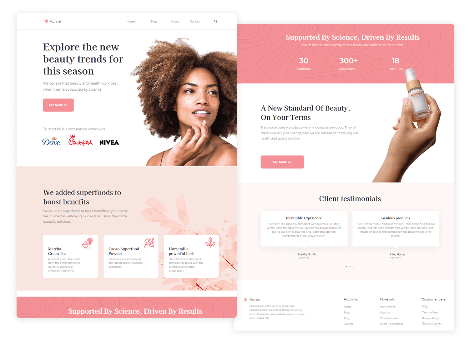
Key Elements Of A Landing Page
The headline is the first thing visitors see. It must be clear and catch attention. Use simple words. Make it about your offer. Keep it short. Make people want to read more. A good headline can make a big difference.
A strong call to action tells visitors what to do next. Use action words. “Buy now” or “Learn more” work well. Make it easy to see. Use bright colors. It should stand out. Guide visitors to take action.
Good visuals make the page look nice. Use images and videos. They should match your message. Pictures can tell stories. Keep them clear and bright. Visuals help people understand better. They make your page interesting.
Trust signals build confidence. Show reviews or ratings. Use logos of known brands. Add testimonials from happy customers. Trust signals make visitors feel safe. They help convince people to stay and buy.
Design Principles
A simple design is easy to understand. Avoid clutter on your landing page. Too many colors or fonts can confuse visitors. Use white space to make content clear. People like to see neat and clean designs. It helps them find information fast. Simple layouts guide users smoothly. They can focus on what matters most.
Consistent design keeps your page neat. Use the same fonts and colors. Make buttons look alike. This helps users feel at home. They know what to expect next. Consistency builds trust in your website. It also makes navigation easier. Users will find what they need quickly.
Responsive design means your page looks good on all devices. Phones, tablets, or computers, it should fit well. People like sites that work everywhere. If a page looks bad, they leave. Test your site on different screens. Ensure everything is visible and easy to use.
Effective Copywriting
Words must be clear and easy to understand. Use simple words. Avoid confusing words. Short sentences are best. They help readers follow your ideas. Organize your thoughts well. Focus on the main point. Avoid extra words. Be direct in your writing.
Persuade readers with strong words. Make them feel interested. Use positive phrases. Show benefits clearly. Write with confidence. Connect with emotions. Make them want to act. Engage them. Ask questions. Invite them to think. Action words help readers feel involved.
Keep text short. Avoid long sentences. Focus on key points. Remove extra words. Get to the point fast. Use bullet points or tables when needed. They make information clear. Save time for readers. Brief writing holds interest. Direct language is best.
Using Analytics
Use analytics tools to see how your page is doing. These tools show how many people visit your page. They also show which parts of the page they like. This helps in making the page better. Look at metrics like bounce rate and conversion rate. If visitors leave fast, changes might be needed. Improving these metrics can lead to more success.
A/B testing is a smart way to test changes. Create two versions of your page. Version A and Version B. Show each version to different visitors. See which one works better. This helps in understanding what users like. Small changes can make a big difference. Test things like headlines and button colors. Choose the version that gets more clicks. This way, your landing page becomes more effective.
Seo Optimization
Using the right keywords is important. They help people find your page. Choose words that people often search for. Use these words in your headings and text. But don’t use too many. It can make your page look bad. It is best to use them naturally. This will make your page better for readers.
Meta tags tell search engines about your page. They help your page show up in searches. Use a short and clear description. Include your main keywords here. This helps search engines know what your page is about. Make sure your meta tags are not too long. Keep them clear and simple.
Improving User Experience
A fast website keeps users happy. Slow pages make visitors leave. Quick loading is important. It keeps users engaged. Images should be small. Compress files to make them smaller. This helps with speed. Check hosting service. Reliable hosting boosts speed.
Test page speed often. Tools like Google PageSpeed Insights help. Fix issues quickly. Optimize scripts and styles. This reduces load time. Keep plugins updated. Old plugins slow down sites. Limit plugins to those you need. Use browser caching. This stores data for faster loads. A speedy site improves user experience.
Easy navigation helps users find things. Use clear labels. Simple menus guide users. Limit menu items. Too many confuse users. Organize content logically. Make important links easy to find. Clickable buttons should stand out. Use a search bar. This helps users find things fast. Consistent design aids navigation. Use the same layout on each page. Users learn where things are. This makes browsing easy. Good navigation keeps users happy.

Credit: unbounce.com
Avoiding Common Mistakes
Crafting a strong website landing page involves avoiding clutter and maintaining a clear, engaging layout. Ensure concise, compelling headlines and focus on user-friendly navigation for better visitor experience. Keep the call-to-action visible and persuasive to drive conversions effectively.
Overloading Information
A landing page should be clear and simple. Giving too much information confuses users. Keep text short and sweet. Important points should stand out. Users like lists and bullet points. They help in understanding. Try using images to explain ideas. Images should be relevant. Avoid using too many colors. Too many colors can distract users.
Ignoring Mobile Users
Many users browse on phones. A site should work well on all devices. Mobile-friendly design is key. Text should be easy to read. Buttons should be large enough to tap. Pages should load fast. Slow pages upset users. Check your site on different phones. Make sure everything works. This helps in keeping users happy.
Case Studies
Crafting an effective landing page involves clear headlines, engaging visuals, and concise calls to action. Highlight key benefits to captivate visitors and encourage conversions. Use testimonials and trust signals to build credibility, ensuring an intuitive layout for easy navigation.
Successful Examples
Some landing pages work better than others. Take Airbnb for example. Their page is clean and simple. You see the search bar first. It invites you to explore.
Another example is Dropbox. Their landing page is easy to understand. It uses few words. It shows their main service clearly.
Lessons Learned
Keeping things simple works best. Use less text. Show key ideas clearly. Highlight what users need to see. Make buttons easy to find. Use images wisely. Images help tell the story.
Good landing pages have a clear call to action. They guide the user. They don’t confuse them. They make the next step clear.

Credit: www.getresponse.com
Frequently Asked Questions
What Makes A Good Website Landing Page?
A good landing page has clear headlines, engaging visuals, and a compelling call to action. It should load quickly, be mobile-friendly, and have concise content. Ensure easy navigation and focus on user experience. Optimize for keywords to improve search engine visibility and drive conversions effectively.
How To Create A Landing Page For A Website?
Start by choosing a user-friendly platform like WordPress or Wix. Select a clean, responsive template. Craft compelling headlines and concise content. Include strong calls-to-action and engaging visuals. Optimize for SEO with keywords. Test and refine for better conversion rates. Keep it simple and focused on the goal.
How To Create A Captivating Landing Page?
Create a clear headline that grabs attention. Use engaging visuals to support your message. Highlight key benefits with concise text. Include a strong call-to-action for next steps. Optimize for mobile and improve loading speed for better user experience.
What Does A Successful Landing Page Look Like?
A successful landing page features a compelling headline, clear call-to-action, and engaging visuals. It offers concise content, builds trust with testimonials, and loads quickly. Effective SEO elements, mobile optimization, and user-friendly design enhance visibility and conversion rates. Ensure the page aligns with target audience needs and expectations.
Conclusion
Creating a good landing page boosts your website’s success. Keep it simple and clear. Focus on strong headlines and visuals. Guide users with easy navigation. Highlight key benefits and features. Use persuasive calls to action. Test and refine your page regularly.
Listen to user feedback. Make sure your landing page loads quickly. Mobile-friendliness is crucial too. Remember, first impressions matter. Your landing page is often the first contact. Make it count. Connect with your audience effectively. Engage them to explore more.
Aim for clarity and purpose. This will enhance user experience significantly.


