Are you struggling to capture your mobile audience’s attention on your WordPress site? You’re not alone.
With more people browsing on their phones, it’s crucial to have a mobile landing page that not only grabs attention but also converts visitors into loyal customers. Imagine having a landing page so compelling that your visitors can’t resist taking action.
In this guide, you’ll discover simple, effective steps to create a mobile landing page on WordPress that does just that. By the end of this article, you’ll have the tools to transform your mobile site into a conversion powerhouse. Ready to make a lasting impression on your mobile visitors? Let’s dive in!
Credit: blog.wishpond.com
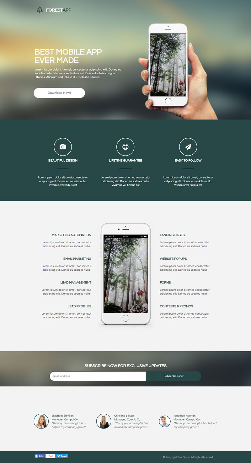
Choosing The Right Theme
Selecting the best theme is very important. Themes should be mobile-friendly and responsive. This means they work well on phones and tablets. Look for themes with clean designs. Simple designs load faster. Fast loading is good for users and search engines.
Make sure the theme supports touch features. People use fingers to tap on phones. Check if the theme has easy navigation. Users should find what they need quickly. Look for themes with customizable options. These let you change colors and fonts easily.
Some themes come with pre-made templates. Templates save time. Choose a theme with good support and updates. Regular updates keep your site secure. Always read reviews before picking a theme. Reviews show what others think.
Installing WordPress
To start, choose a hosting provider. This is where your site lives. Many people like Bluehost or SiteGround. They make it easy to install WordPress. After buying hosting, get a domain name. This is your website’s address, like www.example.com.
Next, log into your hosting account. Find the WordPress installer. It could be called a one-click installer. Click on it and follow the steps. You will need to choose your domain name. Then, set up your WordPress admin details. This includes a username and password. Make sure to remember these details.
After installing, visit your site. Type your domain into a web browser. You should see your new WordPress site. Now, you can start building your mobile landing page.
Selecting Mobile-friendly Plugins
Choose plugins that make your site fast and easy to use on phones. Some plugins help your pages load quickly. Others make your buttons and menus easy to tap. Look for plugins with good reviews. They should work well with different themes. Always read the plugin details before installing. This helps avoid problems later. Some plugins add features to your site. These can include forms or slideshows. Ensure these features work well on mobile screens.
Plugins should also be updated often. Updates fix bugs and improve security. Choose plugins with regular updates. This keeps your site safe and running smoothly. Some plugins also help with SEO. They make your site easier to find online. Pick plugins that improve your site’s visibility. Always test your site after adding a plugin. Make sure everything works as expected.
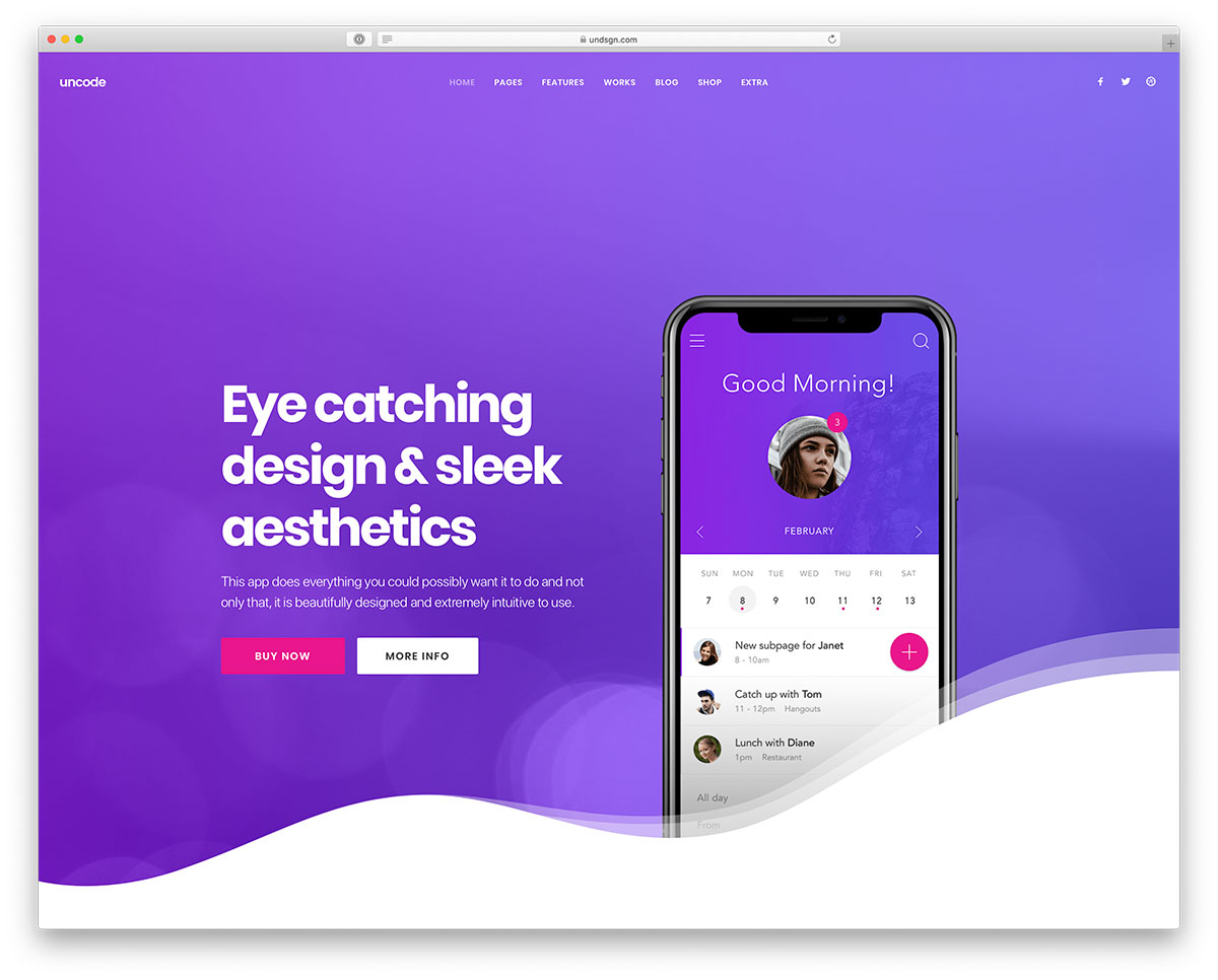
Designing The Layout
Mobile screens are small. So, use responsive design principles. Make sure your page adjusts to different screen sizes. Use a fluid grid layout. This helps the page fit any device. Use CSS media queries to change styles for various devices. Mobile users need easy navigation. Keep menus simple. Use large buttons. Make links easy to click. Avoid tiny fonts. Use readable text sizes.
Visuals make your page interesting. Add high-quality images. Images should load fast. Use image formats like JPEG or PNG. Videos can be engaging. Use them wisely. Keep video files small. Use icons to represent actions. Icons help users understand quickly. Use color contrast for readability. Don’t use too many colors. Stick to a simple color palette. Bright colors catch the eye. But don’t overdo it.
Crafting Compelling Content
A strong headline grabs attention. Use simple words. Make it clear and direct. Ask a question. Or offer a solution. Keep it short. Around 6 to 8 words. Use numbers if needed. People love lists. They help in understanding. Test different headlines. See what works best. Use tools to help you. Like headline analyzers. They can guide you.
Text should be short and easy to read. Use simple sentences. Break long paragraphs. Use bullet points. They make text clearer. Avoid big words. Choose friendly fonts. Make sure text is large enough. Easy to tap links are important. Check how it looks. On different devices. Always test before publishing. Your goal? Make reading easy. On any screen.
Enhancing User Experience
Fast load times are crucial for user happiness. Slow pages can make users leave. Make images smaller for quicker loading. Less code helps, too. Use simple formats. Speed keeps users on the page.
Navigation should be easy. Users love simple menus. Keep options few and clear. Use buttons that are big enough. Clear labels guide users well. Simplicity makes users stay longer.
Testing On Different Devices
Mobile landing pages must work well on all devices. Different devices have different screen sizes. The page must look good on phones, tablets, and computers. Check your page on each device. Ensure images are not too big. Text must be clear and easy to read. Buttons should be large enough to click. Test links to make sure they work. Some devices load pages slowly. Ensure your page loads fast. Avoid using too many images or videos. This can slow down your page. Ask friends to test your page. They can tell you what looks good or bad.
Credit: colorlib.com
Analyzing Performance
Analytics tools help check how your mobile landing page works. They show which parts of the page users like most. Google Analytics is a popular tool. It tells where visitors come from. It also shows how long they stay. Heatmaps are useful too. They show where users click. This helps in fixing any issues. Check these tools often. This will make your page better.
Using Analytics Tools
Using tools is easy. First, set up the tool on your page. Next, watch the numbers. Look at visits and clicks. If numbers are low, something might be wrong. Use these tools to find the problem. Then, fix the page.
Adjusting Based On Feedback
Feedback is important. Ask users what they think. Listen to what they say. Change the page if needed. Small changes can make a big difference. Keep adjusting until users are happy. Happy users visit more. They also tell friends about your page.
Credit: superdevresources.com
Frequently Asked Questions
Can I Create A Landing Page With My Phone?
Yes, you can create a landing page using your phone. Use mobile-friendly page builders or apps like Wix or Squarespace. They offer easy-to-use templates and drag-and-drop features. Ensure your phone has a stable internet connection for smooth operation. Optimize for mobile responsiveness for better user experience.
How Do I Optimize My WordPress Site For Mobile?
Optimize your WordPress site for mobile by using a responsive theme. Compress images for faster loading. Enable browser caching to enhance performance. Use a mobile-friendly plugin like WPtouch. Regularly test your site on different devices for usability.
What Is The Size Of A Mobile Landing Page?
A mobile landing page typically ranges from 320 to 414 pixels wide. Ensure its design is responsive for various screen sizes. Keep it lightweight for faster loading, ideally under 1 MB. Optimize elements like images and fonts for mobile-friendly performance, enhancing user experience and improving search engine rankings.
What Does A Mobile Landing Page Do?
A mobile landing page converts visitors into leads or customers. It provides clear, concise information and a strong call-to-action. Optimized for mobile devices, it ensures quick loading and seamless navigation, enhancing user experience and boosting conversion rates. It effectively targets and engages mobile users for marketing campaigns.
Conclusion
Creating a mobile landing page on WordPress is simple and effective. Focus on clear design and fast loading times. Use responsive themes to ensure a seamless user experience. Optimize images for quicker loading. Prioritize essential information to keep visitors engaged.
Test your page on various devices for consistency. With these steps, your mobile landing page can attract and retain more visitors. Remember, a well-designed page boosts user interaction. Keep it user-friendly and efficient. Continuous improvement is key. Stay updated with the latest trends for the best results.
Your mobile landing page can truly make a difference.