Are you looking to boost your online presence without breaking the bank? Imagine having a powerful landing page that captivates your audience and drives conversions, all without spending a single dime.
Yes, it’s possible! Designing a landing page for free might sound too good to be true, but with the right tools and guidance, you can create a compelling and effective webpage that serves your goals perfectly. In this guide, you’ll discover the secrets to crafting a high-converting landing page using free resources.
Whether you’re launching a new product, building your email list, or promoting a special offer, this article will show you how to design a page that stands out and draws your audience in. Get ready to unlock the potential of your online presence, and keep reading to find out how you can make it happen effortlessly.

Credit: www.figma.com
Understanding Landing Page Essentials
A landing page helps in capturing visitor information. It focuses on a single call to action. This page guides users to a specific goal. It can promote products or collect emails. Clear and direct, it avoids distractions. A good landing page leads to more conversions.
A landing page needs a strong headline. It catches the reader’s attention. The headline should be clear. High-quality images help to engage viewers. Use images that relate to your message. Concise text explains your offer. Keep it simple and direct. Include a call-to-action button. It guides users to take the next step.
Choosing Free Design Tools
Creating a landing page without spending money is possible with free design tools. These tools offer templates and drag-and-drop features, making design simple. Beginners can easily build attractive pages without advanced skills.
Popular Free Tools
Many tools help design a landing page for free. Canva offers templates and easy drag-and-drop features. Adobe Spark is great for creating visual content quickly. Wix allows customizing with ease and offers many free features. Google Sites is simple and integrates well with other Google services. Each tool has its own strengths. Finding the right fit depends on your specific needs.
Features To Look For
Easy-to-use interfaces are important. Templates save time and give a professional look. Customization options allow unique designs. Integration with other tools is useful for smooth workflow. Mobile optimization ensures your page looks good on phones. Analytics help track visitor behavior and improve design. Look for these features when choosing a design tool.
Planning Your Layout
Choose what your page will look like. Think about sections like header, body, and footer. The header often includes a logo and navigation. The body shows main content, like text or images. The footer can have links and contact info. Each part should have clear roles. Keep it simple. Too much detail can be confusing. Use white space to make parts stand out. This helps people focus.
A wireframe is a simple sketch. It shows where things go on your page. Draw boxes for each section. Write down what each box does. No colors or images yet. Just the basic idea. Use a paper or online tool. This step helps you plan layout before adding details. Make sure everything fits well. A clear wireframe makes design easier later. It saves time and effort.

Credit: www.figma.com
Crafting Compelling Content
Headlines grab attention first. They must be short and clear. Use simple words everyone knows. Ask a question or make a promise. This makes people curious. Keep it under 8 words. Make sure it matches your content. People should know what to expect. Use action words. They make your headline strong.
Writing persuasive copy means being clear and simple. Use short sentences. Talk directly to the reader. Like a friend. Explain benefits, not features. Features tell what it is. Benefits tell why it matters. Use positive words. Make the reader feel good. Always be honest. This builds trust. Ask the reader to take action. Like “Sign up now” or “Learn more”. Make it easy for them to do so.
Incorporating Visuals
Images and videos are key to a landing page. Choose clear and relevant visuals. They should match your message. Avoid clutter. Keep the page neat and tidy. Use high-quality images. Blurry images look unprofessional. Videos should be short. Long videos lose attention. Aim for less than one minute. Use videos that tell a story. Stories stick in the mind.
Graphics and icons help guide users. They make the page user-friendly. Use icons for quick understanding. Arrows can show direction. Checkmarks indicate success. Keep the design simple. Too many graphics can confuse. Use colors that stand out. Colors draw the eye. Remember, less is more. A clean page looks inviting.
Optimizing For User Experience
A mobile-friendly landing page is vital. People use phones for browsing. Make text large enough to read. Images should fit screens well. Buttons must be easy to click. Avoid tiny links. Test the design on various devices. Check tablets and phones. Ensure everything displays correctly. A good mobile experience keeps users happy.
Fast loading pages are crucial. Users leave slow sites quickly. Compress images to reduce size. Use fewer large files. Minimize extra scripts and plugins. Keep code clean and simple. Test page speed often. Ensure the site loads in seconds. A quick site holds visitors longer.
Implementing Call-to-actions
Call-to-actions must be clear and simple. Use action words like “Buy” or “Get.” These words tell what to do next. Keep design clean. Use bright colors for buttons. Make them stand out. Avoid clutter. Too many choices confuse users. Size matters. Big buttons catch eyes. Small text can be missed. Keep text easy to read. Use simple fonts.
Place CTAs where users can see them. Top of the page is a good spot. Users notice it first. Middle section works too. Users read content and see CTAs. Bottom of the page is also fine. Users who scroll might want to act. Use white space around CTAs. It draws attention. Avoid hiding CTAs among other items.
Testing And Refining
Crafting a free landing page involves testing layouts and refining elements to enhance user engagement. Focus on clear calls-to-action and concise content. Regularly update your design based on user feedback and analytics for optimal performance.
A/b Testing Methods
Try different versions of your landing page. This is called A/B testing. Show one version to some visitors. Show another version to others. Compare results. Check which one gets more clicks. Look at how long people stay. Find out which design works best.
Gathering Feedback
Ask visitors what they think. Feedback helps improve the page. Use surveys or polls. Ask simple questions. What did they like? What confused them? Make changes based on feedback. Listening helps design a better page.
Publishing Your Landing Page
Designing a landing page for free involves using intuitive tools and templates online. Start by choosing a user-friendly platform. Customize your page with engaging images and clear calls to action.
Final Checks
Review all content before publishing. Check for spelling mistakes. Ensure all links work properly. Make sure images load quickly. Test your page on different devices. Ensure it looks good on phones and computers. Check that the contact form works. Ask a friend to review your page. A fresh pair of eyes helps catch errors. Confirm that the design matches your brand. Everything should feel consistent.
Launching Strategies
Share your landing page on social media. Tell your friends and family about it. Use email to notify subscribers. Add the page link to your email signature. Post in online forums related to your page topic. Collaborate with others to share your page. Join groups interested in your content. Get feedback and improve your page. Use this feedback to make changes. This helps to attract more visitors.
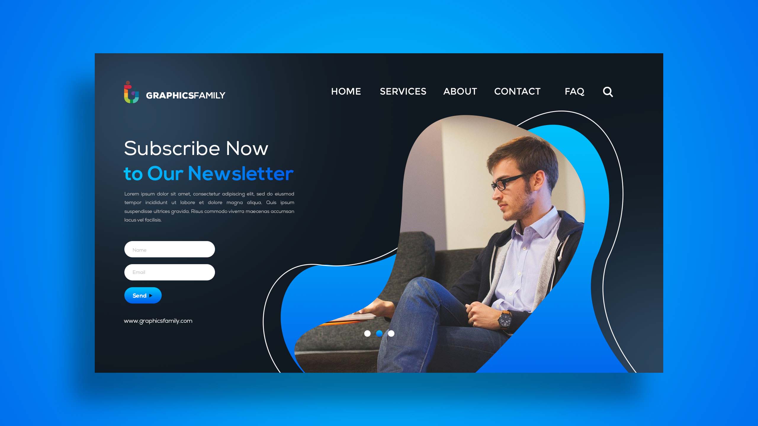
Credit: graphicsfamily.com
Frequently Asked Questions
Can I Create A Landing Page For Free?
Yes, you can create a landing page for free. Platforms like Wix, WordPress, and Mailchimp offer free tools. These tools allow you to design and publish landing pages without cost. You might encounter limitations on features and customization. Upgrading to paid plans can unlock advanced features and better customization options.
What Is The Easiest Way To Create A Landing Page?
Use a drag-and-drop builder like Wix or Squarespace for easy landing page creation. Choose templates, customize text and images, and publish. Optimize with SEO tools provided by the platform.
What Is The Best Platform To Create A Landing Page?
Choose a platform like Unbounce, Leadpages, or Wix for creating effective landing pages. These tools offer user-friendly interfaces and customizable templates. Optimize your landing page for SEO by focusing on keywords, load speed, and mobile responsiveness. Select based on your specific needs and budget.
What Is The Difference Between A Website And A Landing Page?
A website consists of multiple pages offering various information. A landing page focuses on a single goal, like conversion. Websites provide comprehensive details; landing pages drive specific actions. Websites enhance brand identity; landing pages boost marketing campaigns. Both serve different purposes in digital marketing strategies.
Conclusion
Creating a free landing page is easier than you think. Use simple tools and templates available online. Focus on clear design and easy navigation. Make sure your message is concise and compelling. Test your landing page on different devices. Check how it looks on phones and computers.
Gather feedback and make improvements. Remember, a good landing page can boost your online presence. It’s about attracting visitors and converting them into leads. So, start designing today. With patience and practice, you can create effective landing pages. Keep it simple, and you’ll see great results.