Imagine visiting a website, eager to explore its offerings, only to be greeted by a confusing and cluttered landing page. Frustrating, right?
As a visitor, you expect clarity, speed, and engagement. Yet, many websites miss the mark. If your landing page isn’t captivating, you risk losing valuable visitors in seconds. But don’t worry; enhancing your landing page user experience is not an enigma.
By understanding your audience’s psyche, you can create a seamless and intuitive experience that keeps them engaged. This guide will show you how to transform your landing page into a compelling gateway that resonates with your audience and drives conversions. Ready to captivate your users and boost your success? Dive in to discover actionable insights that will make a difference!

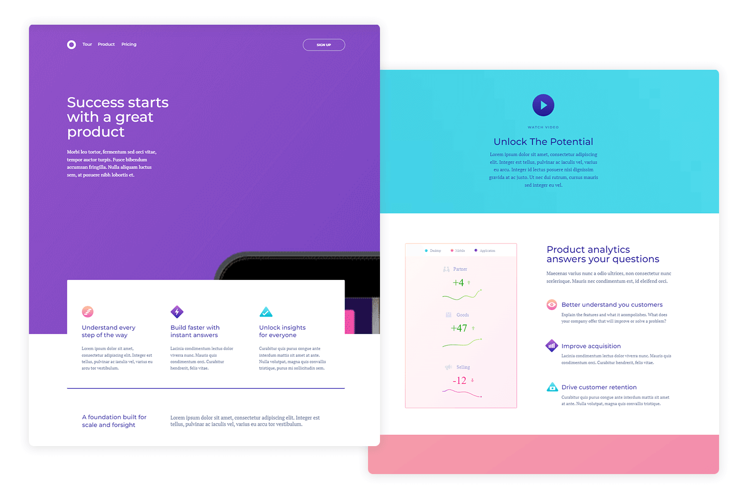
Credit: www.justinmind.com
Landing Page Design Principles
Users notice big things first. So, make key info big. Use bold colors to draw eyes. Headings must be clear. Guide users with arrows or lines. Simple layouts work best. Avoid clutter. Too much info confuses. White space helps focus. It gives breathing room. This makes pages look clean.
Branding must match on all pages. Use same logos and colors. Fonts should be the same style. This builds trust. Users feel safe with known brands. Consistency makes your page look professional. Keep tone of voice the same. It helps in building a connection. Each part should feel like one story.
Many use phones to browse. Pages must work on all devices. Images should fit any screen. Text must be readable. No zoom needed. Make buttons easy to tap. Loading time should be fast. Slow pages lose users. Test pages on different gadgets. This ensures a smooth experience for everyone.

Credit: nitropack.io
Optimizing Page Load Speed
Large images make pages slow. Use image compression tools to make images smaller. This helps pages load faster. Tools like TinyPNG or JPEGmini are great. They keep quality good and make files smaller. Use these tools for every image. Fast images mean happy users.
Too many requests slow down pages. Combine files like CSS and scripts. Use one file instead of many. This makes pages load quickly. Fewer requests mean less waiting time. Users get content faster. Always aim for fewer requests.
Browser caching saves files for later. Next visit, pages load faster. Set up caching on your server. This tells browsers to save files. Cached files mean less loading time. Users enjoy a better experience. Good caching keeps visitors happy.
Effective Call To Action
The placement of a call to action is key. Put it where users can see it easily. Near the top of the page works well. Above the fold is a good spot. You can also place it next to important content. This grabs attention quickly. Make sure it stands out. Use colors that pop.
A button should be simple and clear. Use a bold color that contrasts with the background. Make it big enough to click easily. Keep the text short and direct. Words like “Buy Now” or “Sign Up” work best. Avoid clutter around the button. This helps users focus on it.
Use words that make users feel something. Words like “free” or “exclusive” are strong. Talk directly to the user. Use “you” to make it personal. Keep sentences short and sweet. A sense of urgency can help. Say “limited time” or “only a few left”. This encourages quick action.
Enhancing Content Relevance
Understanding your target audience is key. Who visits your landing page? What do they want? Analyze their needs and preferences. This helps create content they find useful. Content should speak directly to them. Use words they understand. Make them feel seen and heard.
A clear value proposition attracts users. What do you offer? Why should visitors care? Highlight benefits clearly. Use simple language. Make sure the value is obvious. No room for confusion. A strong proposition keeps users interested.
Test content to find what works best. A/B testing helps. Compare two versions of content. See which one performs better. Check user engagement. Analyze clicks, time on page, and conversions. Use results to improve content. Make it more appealing and effective.
Improving Navigation
A simple menu makes navigation easy. Use clear labels for each item. Limit menu items to five or six options. Too many choices can be confusing. Arrange items in order of importance. This helps users find what they need quickly. Use drop-down menus sparingly. They can hide important links.
Breadcrumbs show users where they are on the site. They provide a path back to the homepage. This makes navigation easier. Breadcrumbs are usually at the top of the page. Use simple words in breadcrumbs. This keeps them easy to understand. They should match the page hierarchy.
Interactive elements make pages engaging. Use buttons that change color when clicked. This shows users the button is working. Add hover effects to links. This helps users know they can click. Keep these effects simple. Too many animations can slow down the page.
Utilizing Analytics And Feedback
Analytics tools help see what users do on your page. They show which links are clicked the most. They tell you how much time users spend. This data is very important. It helps improve the page. It shows where users get stuck. Fixing these spots can make the page better.
Heatmaps show you where users click and scroll. They use colors to show popular areas. Red areas mean lots of clicks. Blue areas mean few clicks. Fixing parts with low clicks can help. It can make users happier. It tells you what interests users the most.
User surveys ask visitors about their experience. They tell what users like or dislike. Surveys can be short and simple. They help find problems users face. Users can give ideas to improve the page. Listening to users can make the page better. It can make users feel heard.
Integrating Trust Signals
Testimonials show how others feel about your service. They build trust. Simple words are best. Use reviews from real people. People love reading others’ experiences. Short reviews work well. Long reviews can confuse. Positive reviews increase trust. Use names if allowed. Photos add credibility.
Security badges make users feel safe. Show badges near payment areas. Use well-known badges. They are easy to recognize. Trust increases with visible badges. They signal protection. Users feel their data is safe. Badges must be genuine. Do not use fake ones. They harm trust.
Industry certifications prove your expertise. They show skill in your field. Display certifications clearly. Users trust certified services. Certifications should be up-to-date. Old ones may seem unreliable. They add authority to your page. Users respect certified brands. Use logos to highlight them.

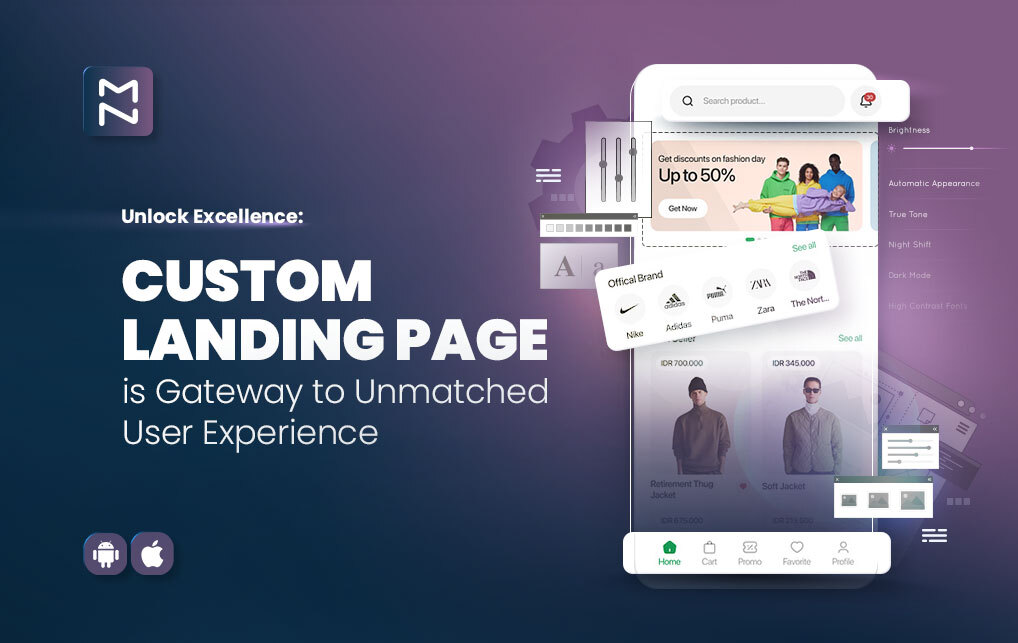
Credit: www.magenative.com
Testing And Iteration
A/B testing helps find what users like. Show two versions of a page. See which one works better. Change one thing at a time. Maybe the color or text. Measure clicks or time spent. Keep what users like best.
Design never stops. Iterative design means making changes often. Listen to user feedback. Make small tweaks. Test again. Improve step by step. Each tweak makes the page better. Design grows with user needs.
Continuous improvement is key for success. Always look for ways to enhance. Use tools to track user behavior. Check what works and what doesn’t. Learn from every test. Keep refining the landing page. Small changes can make a big difference.
Frequently Asked Questions
How Can I Improve My Landing Page Experience?
Enhance user engagement with clear calls-to-action. Optimize loading speed for better user experience. Ensure mobile responsiveness. Use compelling visuals and concise content. Implement A/B testing for improvements.
What Is Landing Page User Experience?
Landing page user experience focuses on providing visitors with easy navigation, fast loading times, and relevant content. It aims to engage users, encouraging them to take desired actions like signing up or purchasing. A positive experience increases conversion rates and enhances brand perception.
How To Make A Landing Page Effective?
Craft a clear headline and value proposition. Use compelling visuals and concise copy. Include a strong call-to-action. Ensure fast loading speed and mobile optimization. Build trust with testimonials and social proof.
How Do You Optimize A Landing Page?
Optimize a landing page by enhancing loading speed, using clear CTAs, and incorporating relevant keywords. Ensure mobile-friendliness, engaging visuals, and A/B testing. Streamline navigation and keep content concise to improve user experience and conversion rates.
Conclusion
Improving landing page user experience is crucial for engagement. Start with clear and concise content. Ensure fast loading times for better retention. Use simple navigation for easy exploration. Mobile-friendly design is key for accessibility. Prioritize user feedback to identify areas for growth.
Test different elements to find what works best. Consistent updates keep the page fresh and relevant. A well-designed landing page encourages visitors to stay. This boosts conversions and enhances overall success. Focus on the user’s needs and preferences. A great user experience leads to satisfied visitors.


