Imagine capturing your audience’s attention the moment they land on your website. A full-screen landing page can do just that.
It immerses your visitors in a visual experience, free from distractions. You might be wondering how you can create such a powerful first impression using CSS. You’ve come to the right place. You’ll discover step-by-step instructions that make designing a full-screen landing page straightforward and manageable.
Say goodbye to cluttered designs and hello to impactful simplicity. You’ll learn how to use CSS to craft a landing page that not only looks great but also enhances user engagement. Curious to know how it’s done? Stick around, and you’ll uncover techniques that can transform your website’s first impression. Embrace the power of CSS, and see how your landing page can become a magnet for attention. Ready to dive in? Let’s get started!

Credit: www.youtube.com
Setting Up The Html Structure
Start by setting up the HTML structure. Use the tag for sections. Each section should have a specific class. This helps with styling later. Make sure to include a for the main content. The goes at the bottom.
Add a container for your content. Use . This keeps everything neat. It also centers the elements on the page.
Add a navigation bar for easy browsing. Use the element. Inside, use for menu items. This creates a list of links. Make sure each link is clear and simple.
Include a hero section with a big image or message. This is the first thing visitors see. Use for this. Add a heading and a short paragraph inside.
Styling With Css
Creating a full-screen landing page with CSS involves setting the height to 100% for the body and HTML. Utilize CSS Flexbox or Grid to center content vertically and horizontally. Apply background images or colors with CSS for visual appeal.
Defining Full Screen Dimensions
First, set the height and width to 100%. This makes sure the page takes up the whole screen. Use the CSS property height: 100vh; for the vertical height. Use width: 100vw; for the horizontal width. This ensures your landing page covers the entire screen.
Applying Background Styles
Choose a background color or image to make it look nice. Use background-color to set a solid color. Use background-image to add a picture. You can also use background-size: cover; to make sure the image fits well. This keeps your page looking neat and professional.
Utilizing Flexbox For Centering
Flexbox is great for centering content. Use display: flex; to start. Use justify-content: center; to center items horizontally. Use align-items: center; to center items vertically. This helps place text or images right in the middle. Now your landing page looks balanced and neat.
Responsive Design Techniques
Mobile screens are different from computer screens. Pages must fit well on phones. This is called mobile compatibility. It helps users see everything clearly. Navigation becomes easy. Buttons and text must be large enough. Users should not need to zoom in. This makes the page user-friendly on phones.
Devices come in many sizes. Pages must adjust for each size. This is called responsive design. It uses flexible layouts. Images and text change size automatically. CSS media queries are useful here. They help in setting rules for different screens. This ensures a consistent look everywhere.
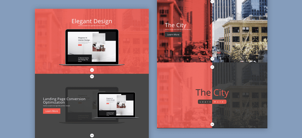
Credit: www.elegantthemes.com
Incorporating Interactive Elements
Hover effects make pages more fun. They change colors or shapes when you move your mouse. Use CSS to make hover effects. It’s easy and looks cool. You can make buttons grow or turn red. Hover effects catch eyes and make users happy. They are simple to add and improve design. They make things look like magic.
Scroll animations make pages exciting. Things move when you scroll down. Use scroll animations to show information bit by bit. They keep users interested and want to explore more. CSS helps you add scroll animations. Make text appear from the side or images zoom in. Scroll animations are fun and easy. They add life to pages.
Optimizing Performance
Creating a full-screen landing page with CSS enhances user engagement. Start by setting the body and html height to 100%. Use flexbox or grid for centering content. Adjust margins and padding for a clean, responsive design.
Minifying Css
CSS files can be large. Minifying CSS makes them smaller. This helps in making websites faster. It removes spaces, commas, and comments. These are not needed for the browser. Minified CSS is quick to download. It saves time and improves performance. A smaller file means a faster page. More people will visit if the page loads fast.
Improving Load Speed
Load speed is important for websites. A fast website keeps users happy. Reduce image sizes for quicker loading. Use lazy loading for images. It loads images only when needed. This saves data and speeds up the site. A fast website is a happy website.
Testing And Debugging
Creating a full-screen landing page with CSS involves precise testing and debugging. Ensure all elements scale correctly on different devices. Adjust margins and padding to maintain a clean look.
Checking Browser Compatibility
Always check your design on different browsers. This ensures it looks good everywhere. Popular browsers include Chrome, Firefox, and Safari. Each browser can show styles differently. Use online tools to check compatibility. This can save you from future issues. Always use the latest browser versions. This helps with better support for new CSS features.
Using Developer Tools
Developer tools are your best friends. They help you find CSS problems. Right-click on your page and select “Inspect”. This opens the tools. You can see your page’s HTML and CSS here. Try changing styles directly in the tools. See the results instantly. Use the “Console” tab to find errors. Fixing errors here can make debugging easy.
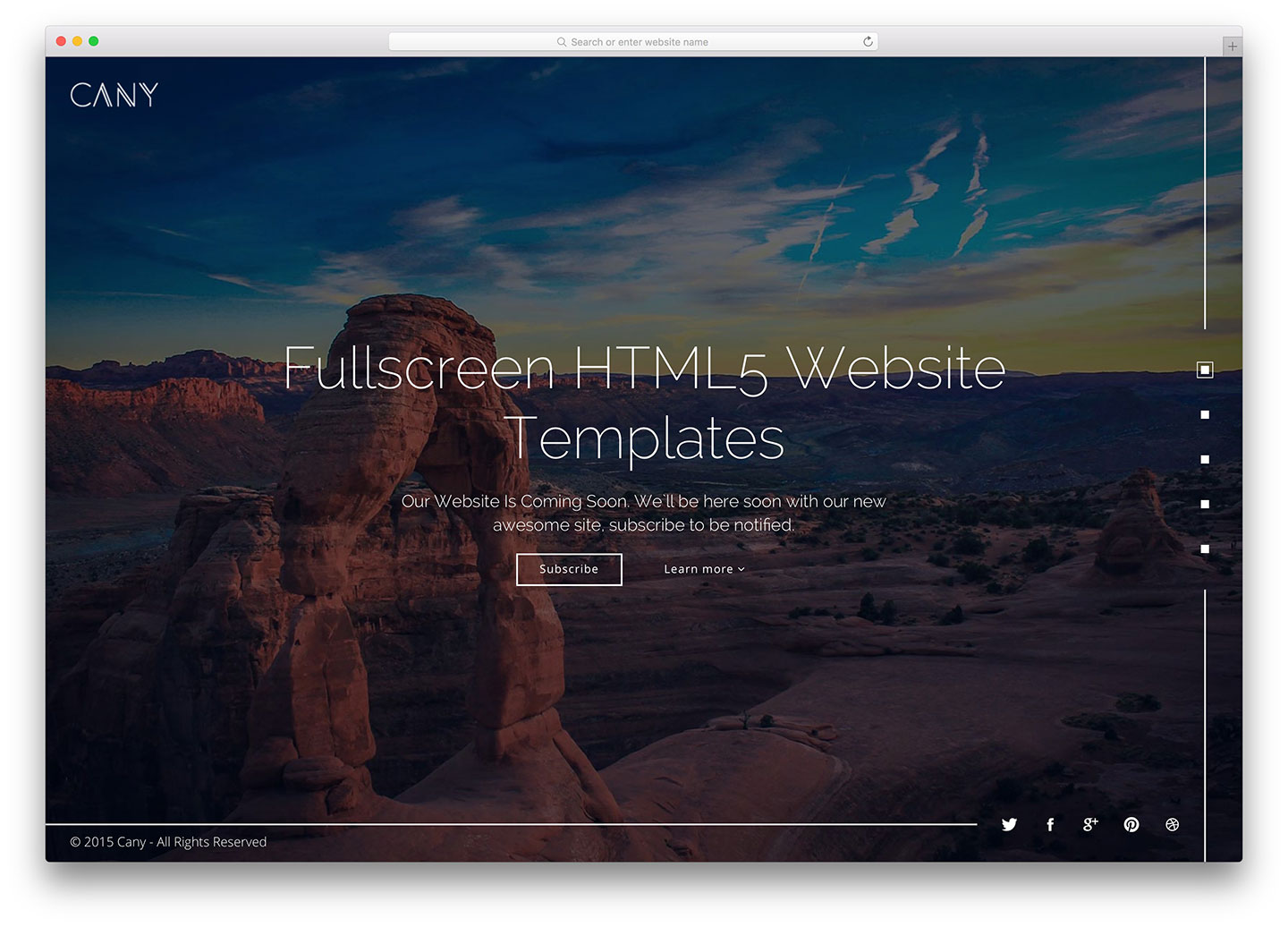
Credit: colorlib.com
Frequently Asked Questions
How To Make A Background Cover An Entire Page In Css?
Use CSS to make a background cover an entire page by setting `background-size: cover;` on the element. Ensure `background-position: center;` and `background-repeat: no-repeat;` for optimal results. This ensures the background image fits and centers across the full page.
How To Make A Web Page Fill The Whole Screen?
Use CSS to make your web page fill the screen. Set `html` and `body` to `height: 100%`. Apply `width: 100%` and `height: 100%` to the container element. Ensure `margin` and `padding` are set to `0`. Use `viewport` units for responsive design.
How To Make Background Fit Screen In Css?
Use `background-size: cover;` in CSS to make the background fit the screen. This ensures the image covers the entire viewport without distortion. Apply it to the element’s style. Add `background-position: center;` to align the background centrally for a balanced look.
How To Make Background Image Full Screen In Css?
Use CSS to make a background image full screen by setting properties: background-size: cover; background-position: center; background-repeat: no-repeat; and background-attachment: fixed. Ensure the element covers the viewport height and width for a seamless full-screen effect.
Conclusion
Creating a full-screen landing page with CSS is simple and effective. Focus on clean design and clear messaging. Use CSS to control layout and style. Ensure your page is responsive for all devices. Test across different browsers for consistency. A well-designed landing page captures attention.
It encourages visitors to engage with your content. Remember, simplicity often leads to better user experiences. Keep refining your skills. Practice makes perfect. With these tips, you can create impactful landing pages. Tailor each page to your audience’s needs. Enjoy the process of designing.
Happy coding!


