Have you ever clicked on a landing page only to find yourself confused by its layout or overwhelmed by its design? You’re not alone.
Understanding the standard dimensions for landing pages is crucial for creating an effective and engaging user experience. But with so many different screen sizes and devices, how do you know what dimensions work best? You’ll discover the optimal landing page dimensions to ensure your visitors stay focused and engaged.
We’ll guide you through the essentials of page sizing, so you can create a landing page that not only captures attention but also converts. Stick around; your perfect landing page is just a few scrolls away.
Importance Of Landing Page Dimensions
Landing pages help grab visitor attention. Correct dimensions make them work better. Most screens are 1024×768 pixels or larger. This size fits well on many devices. It helps keep visitors on the page. Buttons should be easy to click. Fonts must be easy to read.
Images should not be too big. They should load quickly. Slow pages lose visitors. A good layout makes information easy to find. Keep the important stuff at the top. People don’t like scrolling too much. Good design can make a big difference.
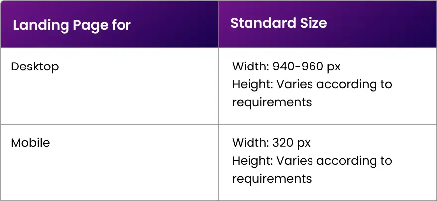
Common Dimensions For Desktop
Landing pages should be easy to view on desktop screens. A common width is 1200 pixels. This fits well on most screens. The height can vary based on content. A good height is often between 600 to 800 pixels. This helps in keeping content visible without scrolling.
Choosing the right aspect ratio is important. The common ratio is 16:9. This ratio works well for most screens. It makes the page look balanced. Some prefer a 4:3 ratio for a more square look. This ratio can make text more readable. Both options are popular and effective.
Mobile Landing Page Sizes
Responsive design makes a page look good on all devices. A flexible layout adjusts to different screen sizes. For mobile, this is very important. It helps in providing a good user experience. The content must be easy to read and navigate. Images should resize to fit the screen. Buttons should be large enough to tap.
| Device | Resolution |
|---|---|
| iPhone 11 | 828 x 1792 |
| Samsung Galaxy S20 | 1440 x 3200 |
| Google Pixel 4 | 1080 x 2280 |
Credit: marketinglad.io
Tablet-specific Dimensions
Tablets are bigger than phones. Smaller than computers. They sit right in the middle. This balance is key for design. Landing pages must fit both ways. Keep the design flexible. Responsive design helps adjust size. Make sure buttons are easy to press. Text should be clear to read. Images need to load fast. This keeps users happy. Tablets offer more space than phones. Use it wisely. Consider touch and tap features. These are crucial for tablets. Users want smooth navigation. Design must cater to this need.
Tablet users expect clear layouts. They like fast loading pages. Content should be engaging. Keep paragraphs short. Avoid too much text. Use images wisely. They break up content. Buttons must be large enough. Easy to tap. Navigation should be simple. Users need to find info quickly. Font size is important. Make it readable. Use enough white space. This improves clarity. Test designs on real tablets. Ensure everything looks good. Users want a smooth experience. This keeps them coming back.
Designing For Different Devices
Adaptive design uses different layouts for various screen sizes. Designers create several fixed layouts. Each layout fits specific devices. This ensures a good user experience. Adaptive design works well for known screen sizes. It’s useful for tablets, phones, and desktops. Responsive design adjusts itself to fit any screen. It uses flexible layouts that change based on the device. This is more fluid than adaptive. Responsive design is great for unknown screen sizes.
Flexible grids are key in responsive design. They use percentages instead of fixed widths. This helps the layout adapt to any screen size. Grids make sure elements stay in place. Images and text adjust smoothly. Designers use CSS to build these grids. They ensure content looks good on all devices. Flexible grids are important for mobile and desktop viewing.
Tools For Testing Page Dimensions
Design tools help create landing pages. Adobe XD offers great features. Sketch is popular among designers too. Figma allows for team collaboration. These tools make design easy.
Testing tools are essential. Google PageSpeed Insights checks page speed. GTmetrix analyzes performance. Pingdom offers detailed reports. These tools ensure pages load fast.
Testing on real devices matters. Use smartphones and tablets for tests. Check how pages look on different screens. This helps find any issues.
Ask friends to test the page. Feedback from real users is important. They see things designers might miss. User feedback leads to better pages.
Best Practices For Effective Landing Pages
Fast load times are crucial for landing pages. Slow pages lose visitors quickly. Use compressed images and minified code. Reduce the number of redirects to speed up loading. Keep scripts and stylesheets to a minimum. A quick page keeps users happy and engaged.
Users should feel valued and understood. Focus on simple navigation and clear information. Avoid clutter and confusing layouts. Make sure content is relevant and easy to find. User-friendly designs boost satisfaction and trust. Happy users are more likely to stay and explore.
Credit: www.apexure.com

Credit: www.linkedin.com
Frequently Asked Questions
What Size Should A Landing Page Be?
A landing page should ideally be 1920 pixels wide for desktops and 375 pixels wide for mobile devices. Keep the height as short as possible while ensuring all essential content fits. Optimize images and elements for faster loading and better user experience.
What Is The Best Layout For A Landing Page?
A successful landing page layout includes a clear headline, compelling visuals, concise copy, and a strong call-to-action. Incorporate trust signals like testimonials or logos. Ensure mobile-friendliness and fast loading times. Keep navigation minimal to focus user attention on the conversion goal.
What Is The Aspect Ratio For A Landing Page?
A typical landing page aspect ratio is 16:9, offering optimal viewing on various devices. This ratio ensures content is engaging and visually appealing, enhancing user experience and conversion rates. Tailoring your design to fit this standard can improve accessibility and effectiveness of your landing page strategy.
What Is The Landing Page Format?
A landing page format includes a clear headline, engaging visuals, concise copy, and a compelling call-to-action. It should be mobile-friendly, fast-loading, and optimized for conversions. Use bullet points or sections for easy readability and focus on one main goal or offer.
Conclusion
Choosing the right landing page dimensions helps boost your website’s performance. Always consider your audience’s device preferences. Mobile users need responsive designs. Desktop users prefer larger layouts. Keep your page simple and clear. Avoid clutter. Focus on essential elements. Test different dimensions to find what works best.
Analyze your results regularly. Adjust as needed for improvement. Tailor your design to your specific audience. The right dimensions enhance user experience and conversion rates. Remember, a well-designed landing page makes a lasting impression. Engage your visitors effectively. Aim for simplicity and clarity.