Ever found yourself staring at a landing page, wondering why it just doesn’t click? You’re not alone.
Crafting the perfect landing page is more than just slapping on some text and images. It’s about creating an experience that speaks to your audience and nudges them towards action. Imagine your landing page as a warm handshake that welcomes visitors and whispers, “You’re in the right place.
” But what does that handshake look like? You want your landing page to be more than just visually appealing. It should be a magnet, pulling in your audience with its clear message and compelling design. Think of it as the first impression you make when meeting someone new. Would you want that impression to be dull and forgettable, or engaging and memorable? As you read on, you’ll uncover the essential elements that transform a landing page from bland to brilliant, ensuring it captivates and converts. Dive in to discover how you can turn every click into a connection.
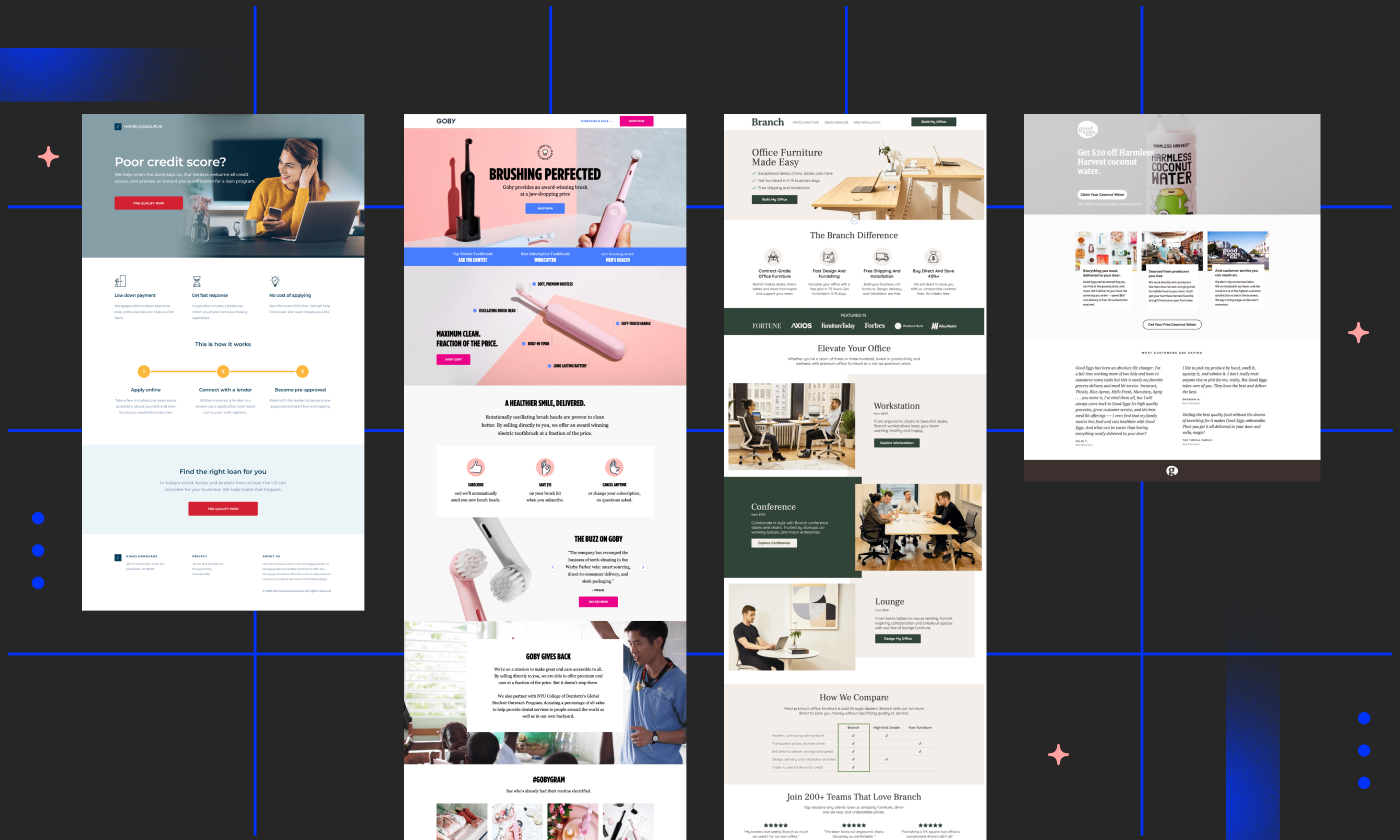
Credit: unbounce.com
Key Elements Of A Landing Page
A strong headline grabs attention. It tells what the page is about. The subheadline adds more details. It supports the main headline. Both should be clear. Short and to the point. They tell visitors why they should stay. They are the first thing people see. Make them count.
A call to action, or CTA, is very important. It tells visitors what to do next. Like “Buy Now” or “Sign Up”. It should be clear and bold. Use action words. Make it stand out. A good CTA leads to more clicks. More clicks mean more success.
Pictures and videos make a page lively. They catch the eye. People like to see more than just text. Use images that match your message. Visual content can show how a product works. Or how it helps. It makes the page interesting. Keep it simple and clear. Not too crowded.
Design Principles
Colors make a page pop. Use bright colors for buttons and important text. Soft colors work well for backgrounds. They help focus the eyes on main parts. Keep the color palette simple. Just a few colors work best. Too many can be confusing. Balance is key.
Fonts matter a lot. Pick fonts that are easy to read. Large fonts are good for headings. Smaller fonts fit well for regular text. Use bold for important words. It helps readers know what matters. Too many fonts can clutter. Stick with two or three max.
The layout shows how things are placed. Clean layouts are best. They guide the eyes naturally. Use grids to keep things neat. Space between elements helps clarity. Align text and images properly. It makes the page look tidy. Remember, less is more.
User Experience
Clear navigation is crucial for a landing page. Users should find what they need quickly. Use simple links. Keep menus short. Make important links stand out. Avoid clutter. Guide users with easy-to-follow paths. This makes them happy. They stay longer and explore more.
Fast loading is key. Users lose patience with slow pages. Optimize images. Reduce file sizes. Use caching techniques. Ensure scripts load quickly. Keep your page size small. Speed matters. Faster pages get more attention. Users stay and engage more. Speed enhances experience.
Mobile-friendly design is essential. Many use phones to browse. Ensure pages adjust to screen size. Text must be readable. Buttons should be easy to click. Images should fit well. Responsive design keeps users happy. They find what they need easily. No zooming needed. Simple navigation on mobile is a must.
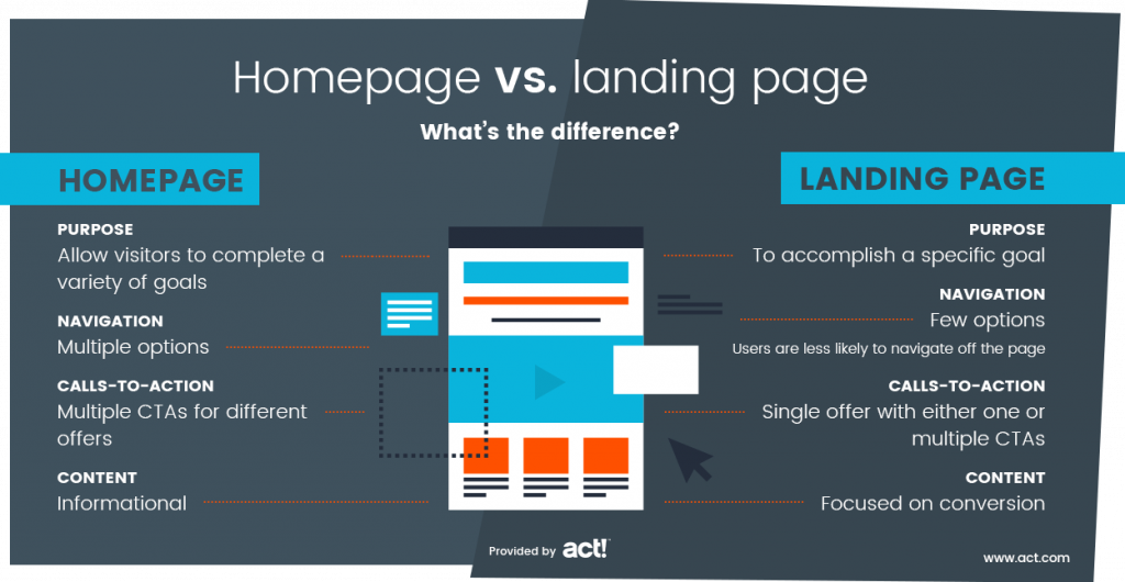
Credit: www.act.com
Persuasive Copywriting
Visitors have problems. Address these pain points. Show empathy. Understand their worries. Offer solutions. Build trust through words. Connect with their needs.
People need to know benefits. Highlight how they gain. Show them what they get. Make it clear. Use simple words. Benefits should be obvious.
Make them act fast. Create urgency with words. Limited time offers. Show why now is best. Use action words. Encourage quick decisions.
Trust Signals
Real words from happy customers. These can make others trust you. People like to read what others say. Testimonials give proof. They show your product is good. Add real names if you can. It builds trust. Photos help too. It feels more real. Keep it simple and honest.
Certifications show you know your stuff. They tell visitors you are skilled. People trust certified businesses. Place logos of your certifications clearly. Make them easy to see. It gives confidence. It shows you follow rules. Certification logos are like trust badges. They are important.
Online safety is key. Security features protect data. People want their info safe. Use SSL for secure links. Show safety logos. Tell users you care about their safety. Secure sites build trust. Make your security features visible. It shows you are responsible. People feel safe to share info.

Credit: unbounce.com
Testing And Optimization
A/B Testing is a way to make things better. You create two versions of your page. One is A, and the other is B. Show each version to different people. Compare which one works best. This helps to see what people like more. It can be the button or the color. Simple changes can make a big difference. Always test to find the best option.
Analytics tell you how people use your page. They track clicks, views, and time spent. Data from analytics helps understand visitor actions. This tells you what works and what does not. Adjust your page based on this data. Tracking is key to knowing what users want.
Always aim to make your page better. Look at data and feedback. Change things that do not work well. Keep testing and tracking. Improvement is an ongoing process. Make small changes often. This keeps your page fresh and effective. Never stop improving. Your page will get better with time.
Frequently Asked Questions
What Should A Landing Page Include?
A landing page should include a clear headline, engaging visuals, concise copy, and a strong call-to-action. Add social proof like testimonials and trust signals. Ensure fast loading speed and mobile responsiveness. Use SEO-friendly elements for search visibility. Keep the design clean to focus users on conversion goals.
What Does A Good Landing Page Look Like?
A good landing page is visually appealing, with clear headlines and concise text. It includes strong calls-to-action, optimized images, and quick loading times. Ensure mobile responsiveness and minimal distractions. Focus on valuable content that addresses user needs and encourages conversions.
Utilize relevant keywords for better search visibility.
How Do You Structure A Landing Page?
A successful landing page features a compelling headline, engaging visuals, and concise content. Highlight benefits and include a clear call-to-action. Use testimonials for social proof and ensure mobile responsiveness. Optimize for fast loading and incorporate keywords for SEO. Keep the design simple and focused on the primary objective.
What Is The Format Of A Landing Page?
A landing page typically includes a compelling headline, clear call-to-action, engaging visuals, concise benefits, and lead capture form. It focuses on converting visitors into leads or customers with minimal distractions. This format ensures effective communication and enhances user experience, boosting conversion rates and SEO performance.
Conclusion
A successful landing page needs clear and direct elements. It should focus on one key message. Use simple visuals and concise text. Make sure there’s one strong call to action. This helps visitors know what to do next. Keep the design clean and uncluttered.
A user-friendly layout improves engagement. Test different versions to find what works best. Always think about the visitor’s experience. This increases the chances they will convert. Remember, a great landing page attracts and holds attention. Simple and effective is the goal.


